
Waterford Whisky:
Selected Works
The Barley Symbol:
Symbol is a big word. In religion, literature and art, symbolism has intrigued thinkers and believers, writers and artists down the ages. This 'Barley Symbol' was created for Waterford Distillery as part of their visual identity. A simple mark that imbues meaning and acts as a signpost to the brand.
Shaped like a grain of barley which is at the core of everything they do. It conveys the continuous cycle of nature, the furrows in the fields, the panelling lines of the distillery building and the eye of mother earth herself.
Simplicity of form creates a versatility that enables it to work across multiple different materials and mediums from printed, digital, foiling, embossing, embroidery, metal, glass and even neon lighting.
The Quest Deck of Cards:
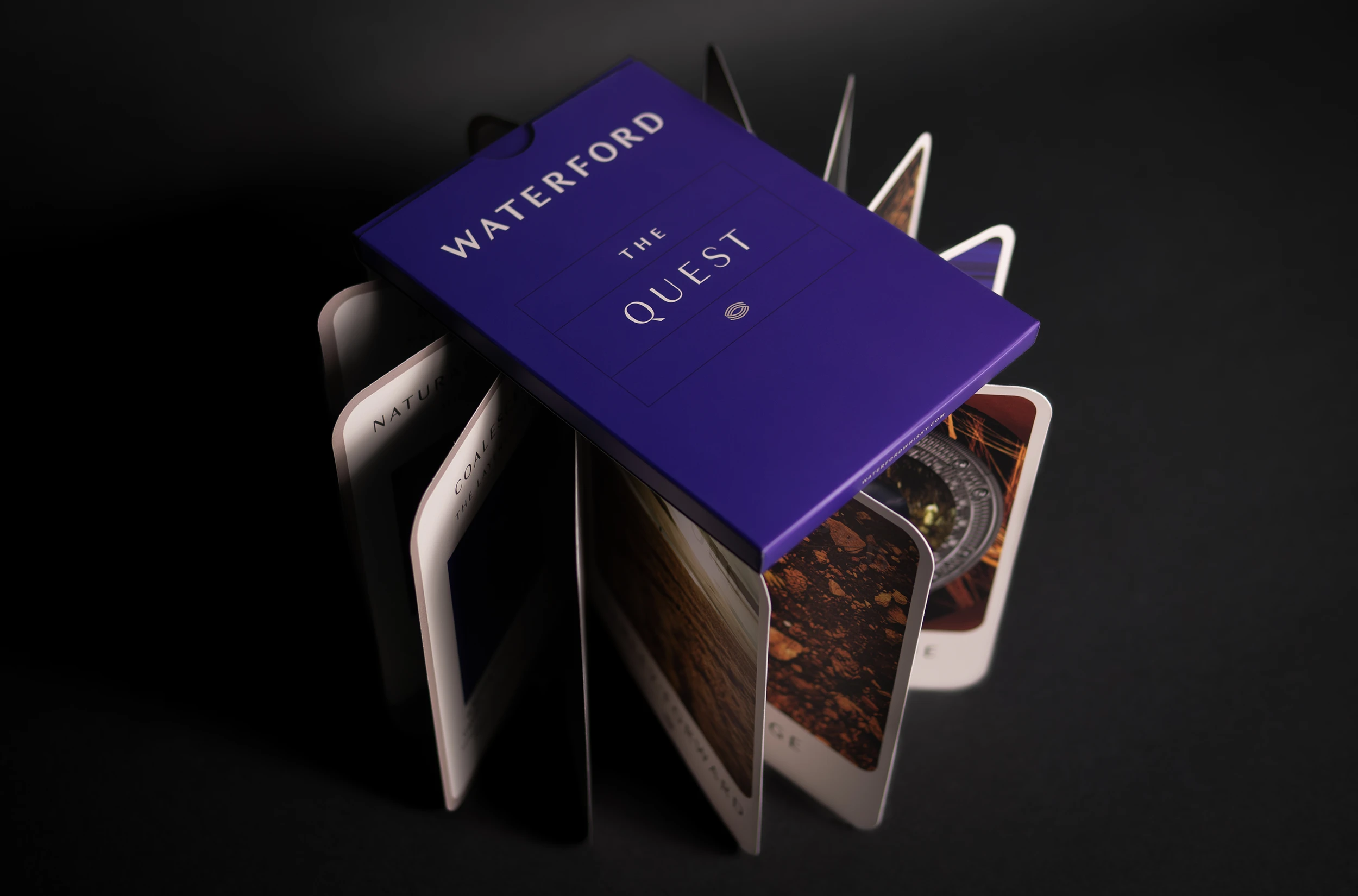
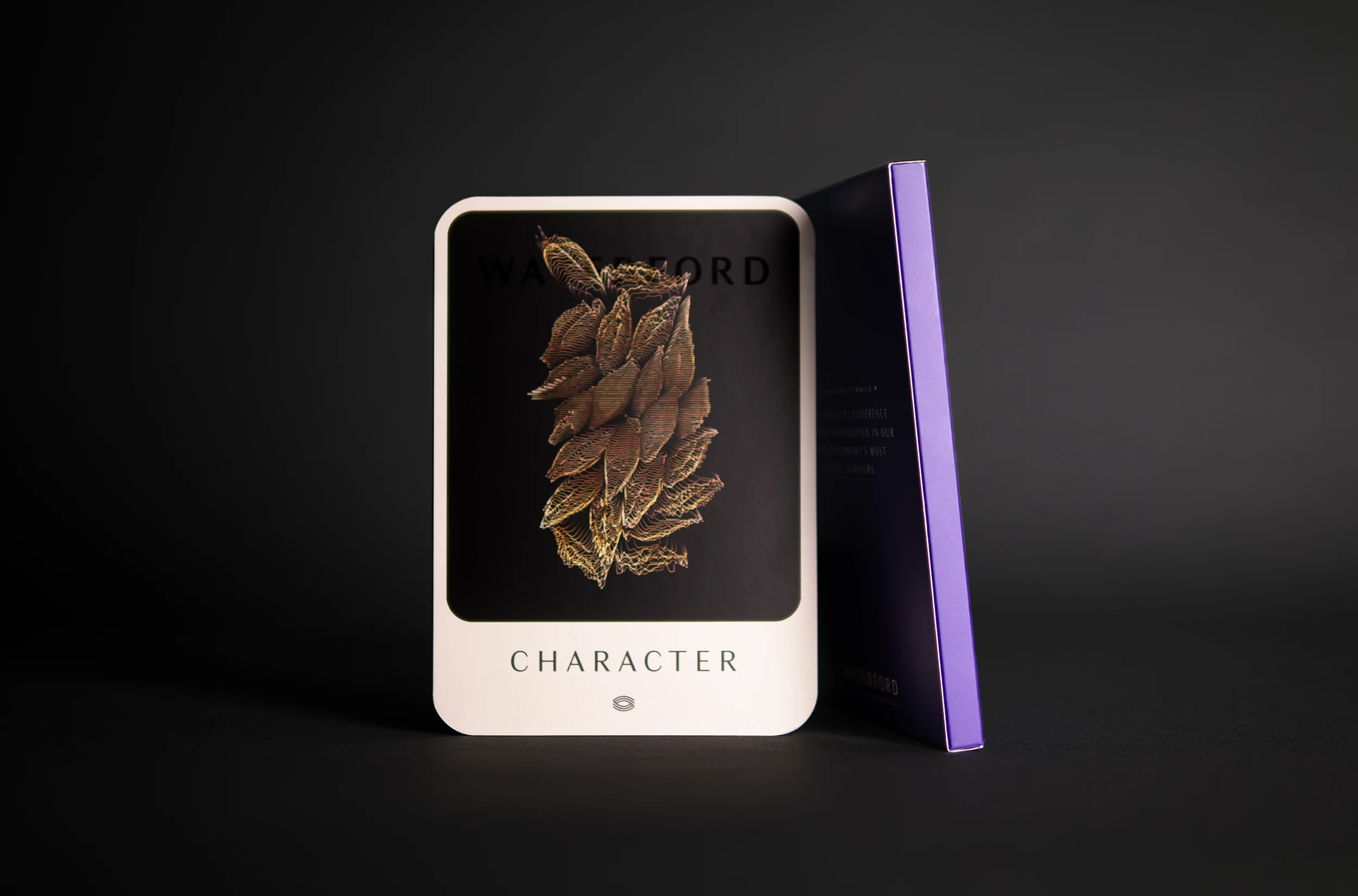
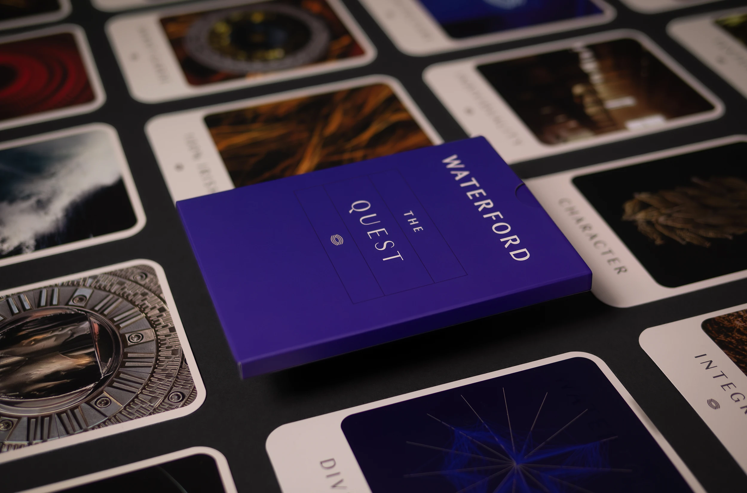
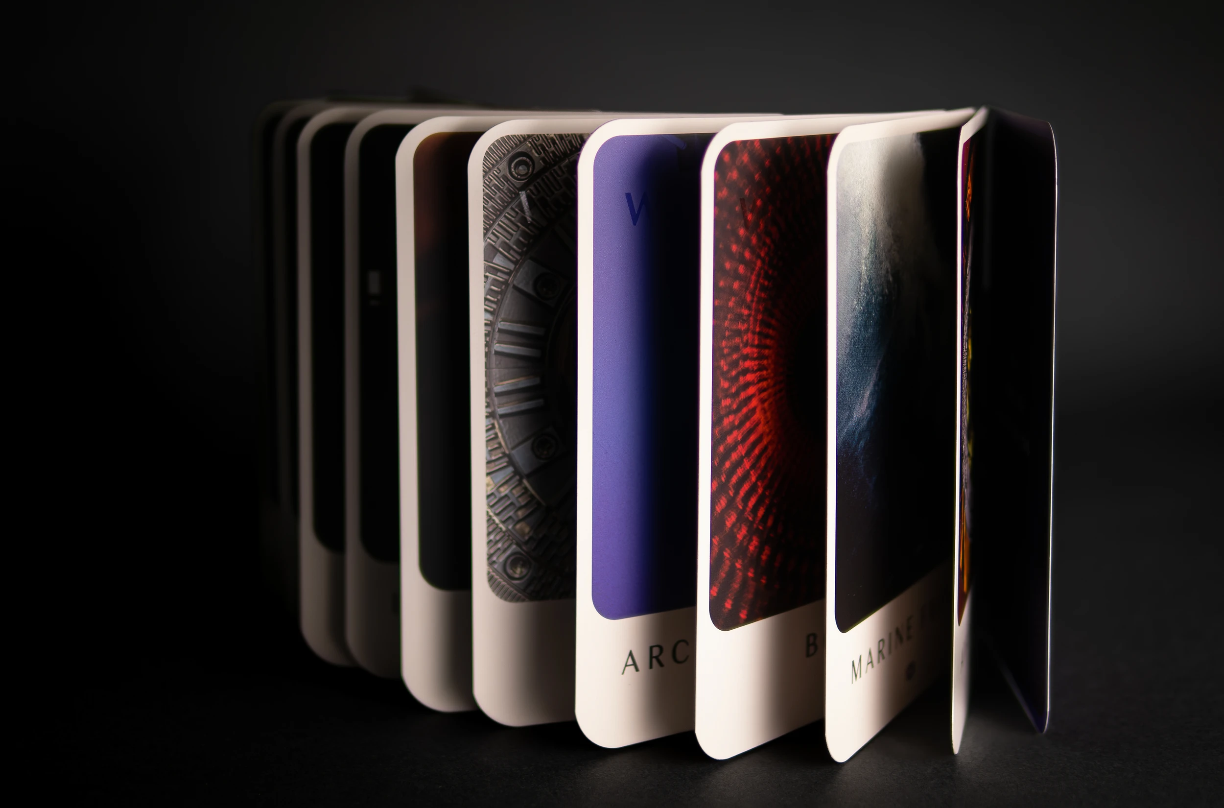
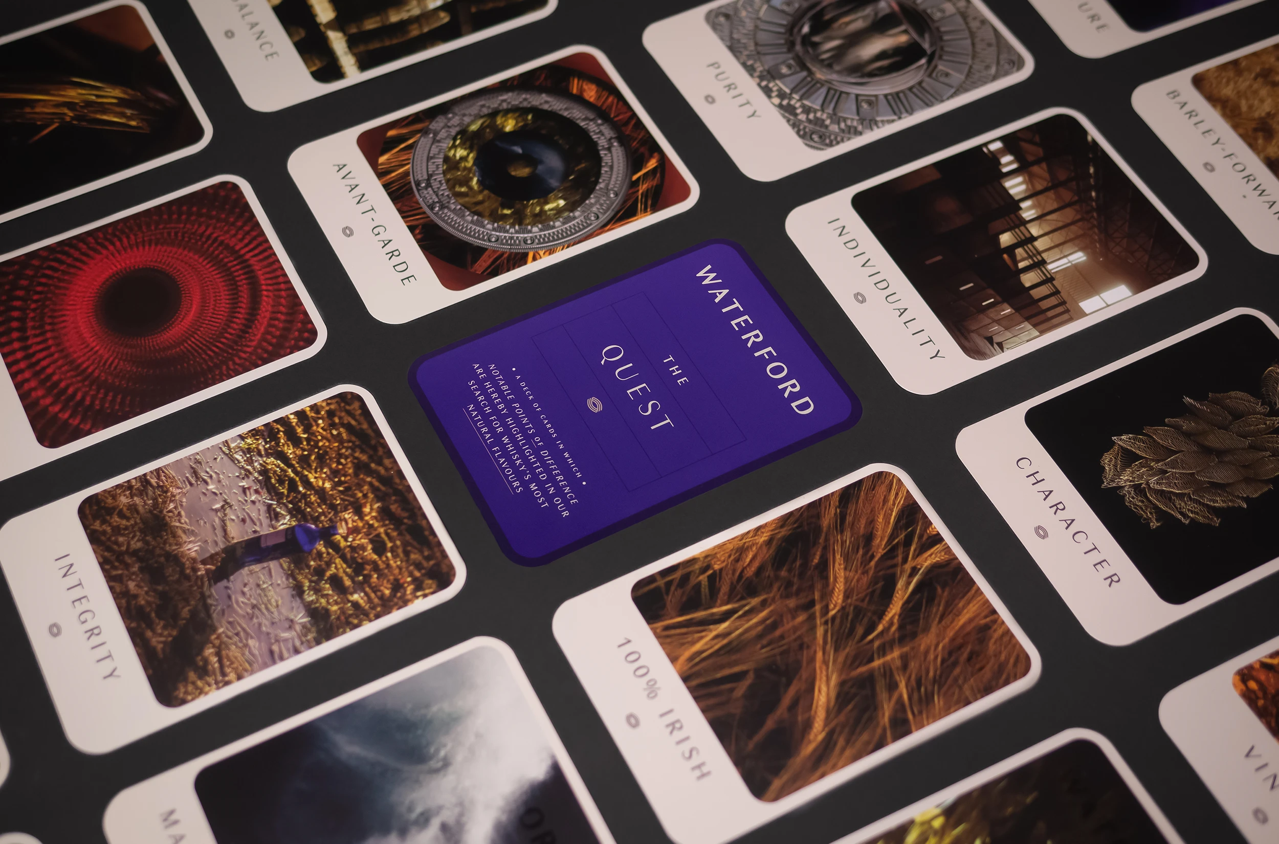
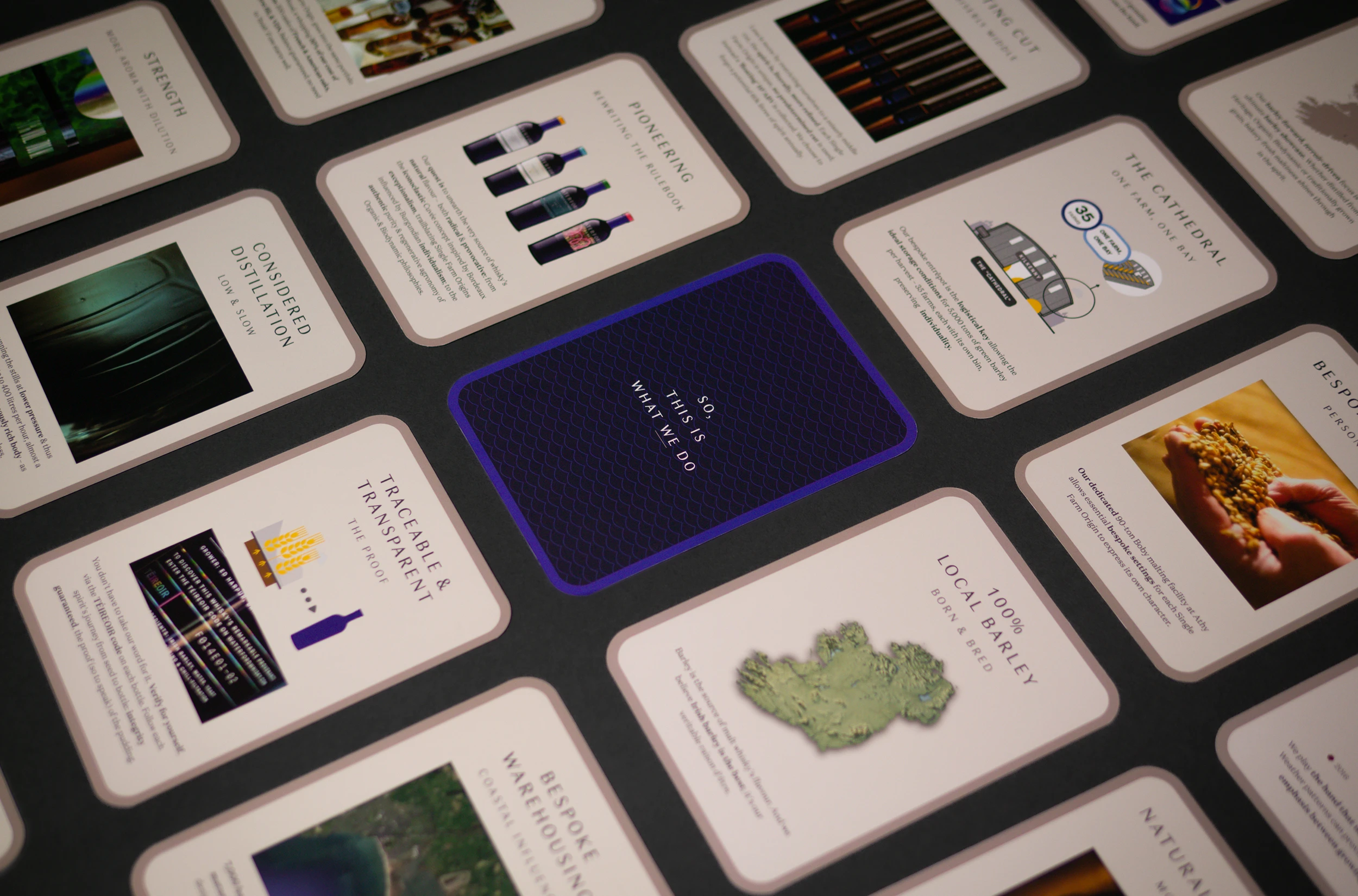
To make whisky requires many factors. Waterford whisky have taken the production methods to the next level and employ world's first methods to produce their product. The brief was to produce a tool to aid employees and the sales team in their conversations with customers and retailers to understand what makes this whisky so special. With unparalleled production methods and a unique philosophy there was a lot to tell.
A pack of cards was a novel method to deliver a wealth of information into bite sized chunks. Separate cards are more interactive and give the ability to dive in and focus on a specific area of interest or characteristic. The nonlinear nature meant no one feature was highlighted above another, but that all these individual components contribute to the whole. Produced in playing card weight material with rounded corners, an outer box, and finished in biodegradable matt laminate for protection when handled. These were distributed worldwide and produced in both English and French languages and adapted into an interactive experience for their website.
[ Link ]
→ 100 Archive Selection
→ IDI Award Winner 2024 – Data Visualisation

William Barley Illustrations:
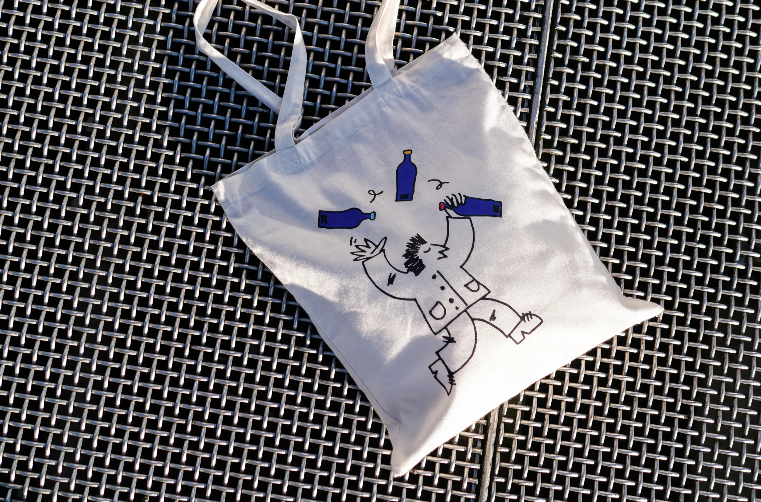
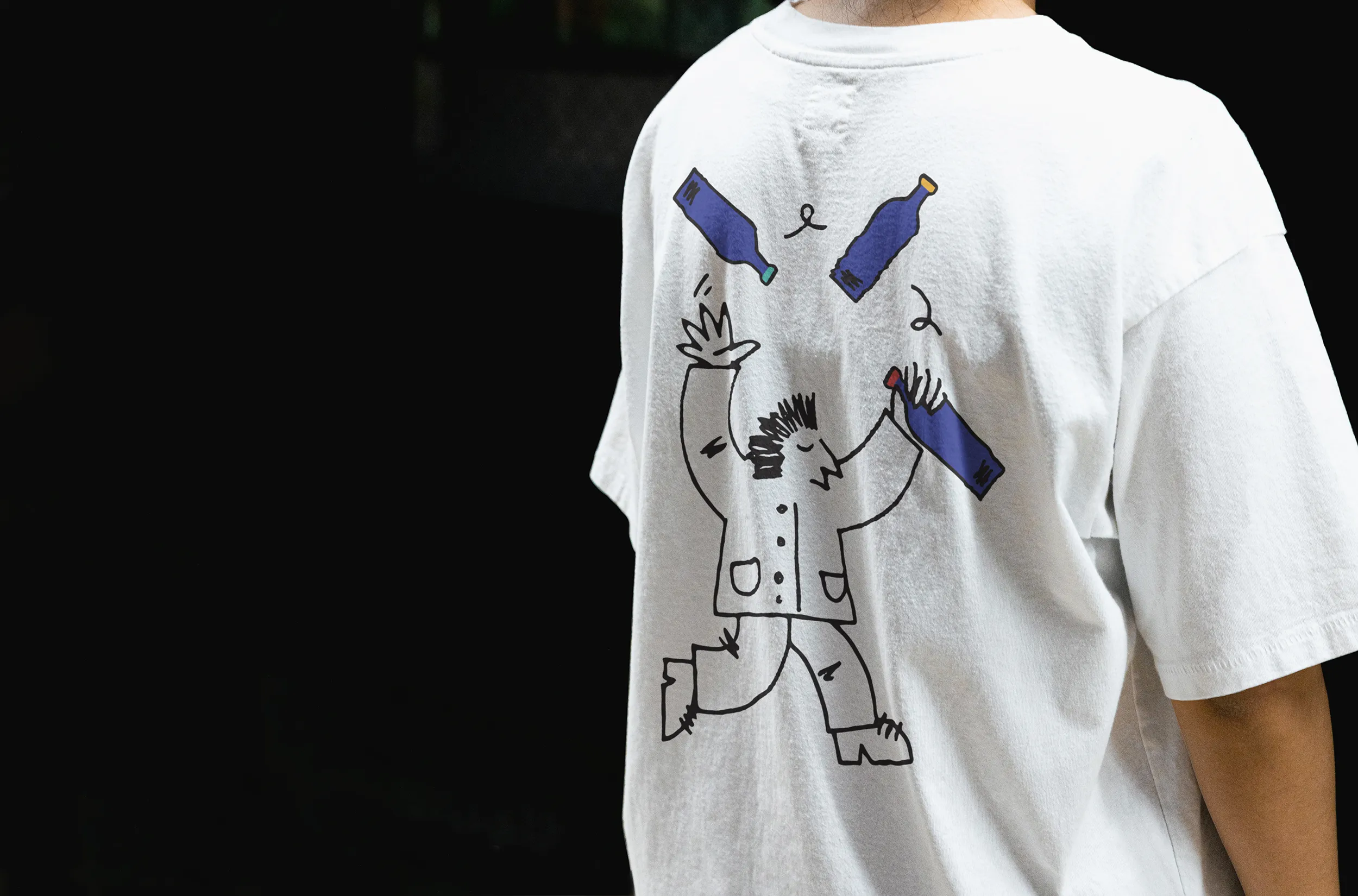
‘William Barley’ is an energetic, if a little chaotic, character kept busy managing the day to day activities of the distillery. These are the first in a series of character illustrations developed for marketing and merchandise activities for Waterford Whisky. The use of illustrations break up the reliance on photographic imagery to convey concepts and help add some light heartedness to communications. They were screen printed onto organic fair trade cotton tote bags and t-shirts for sale in the store.
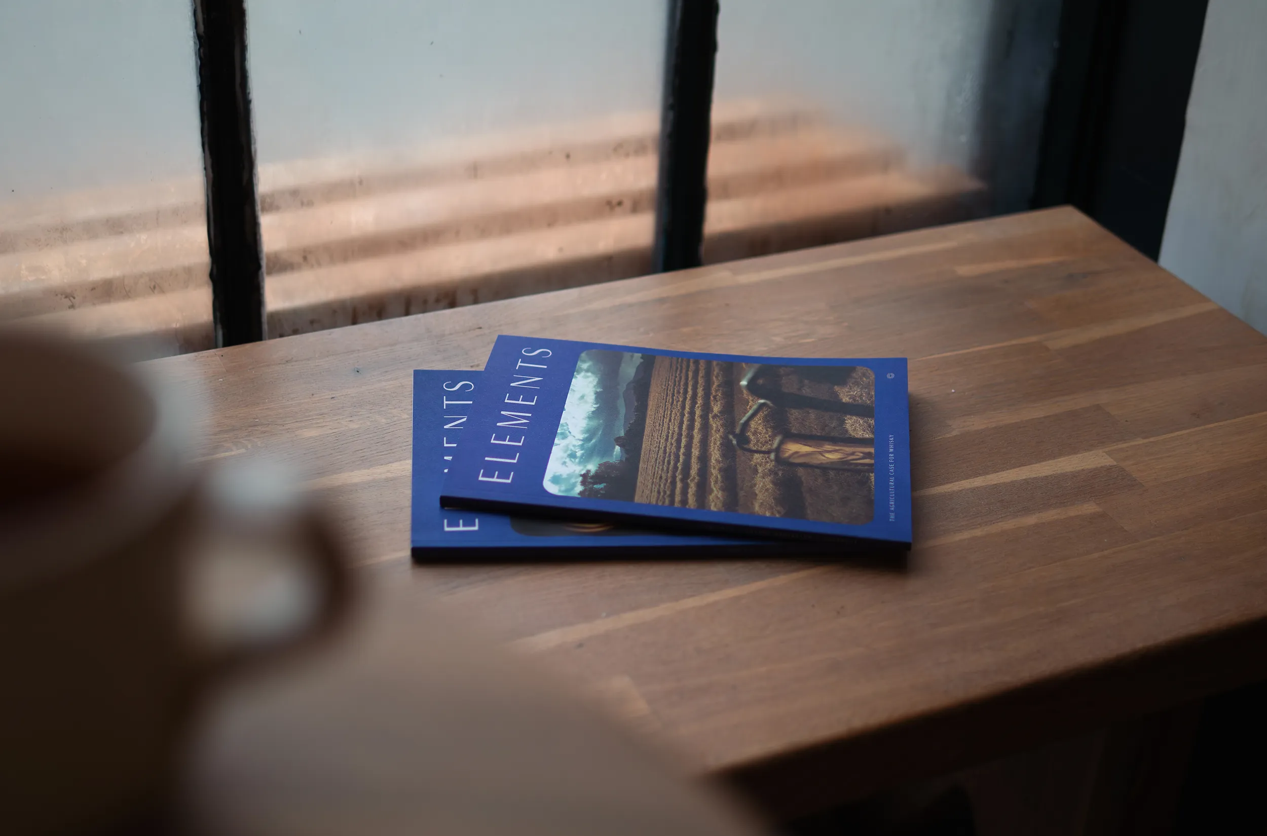
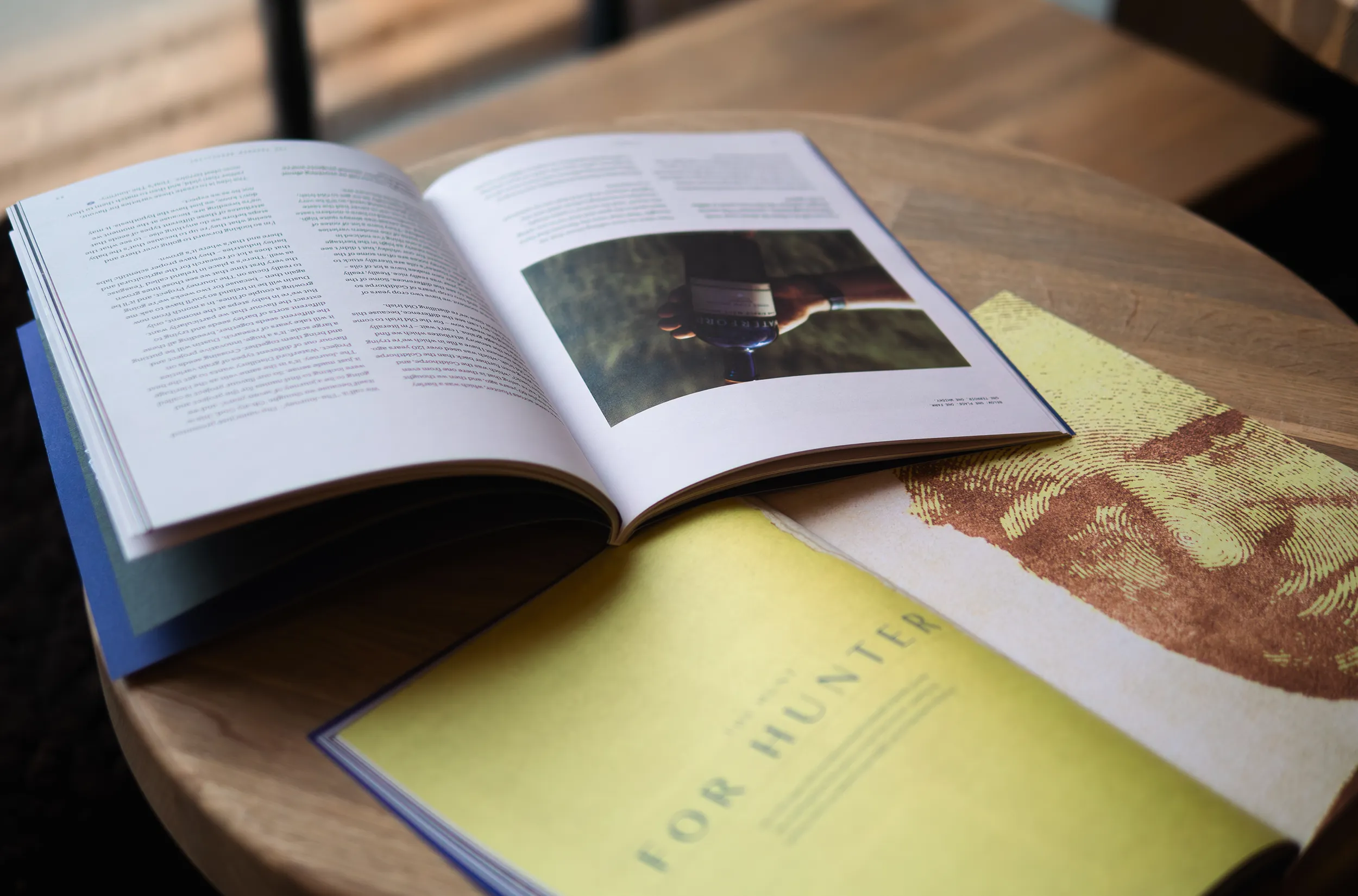
Elements Journal:
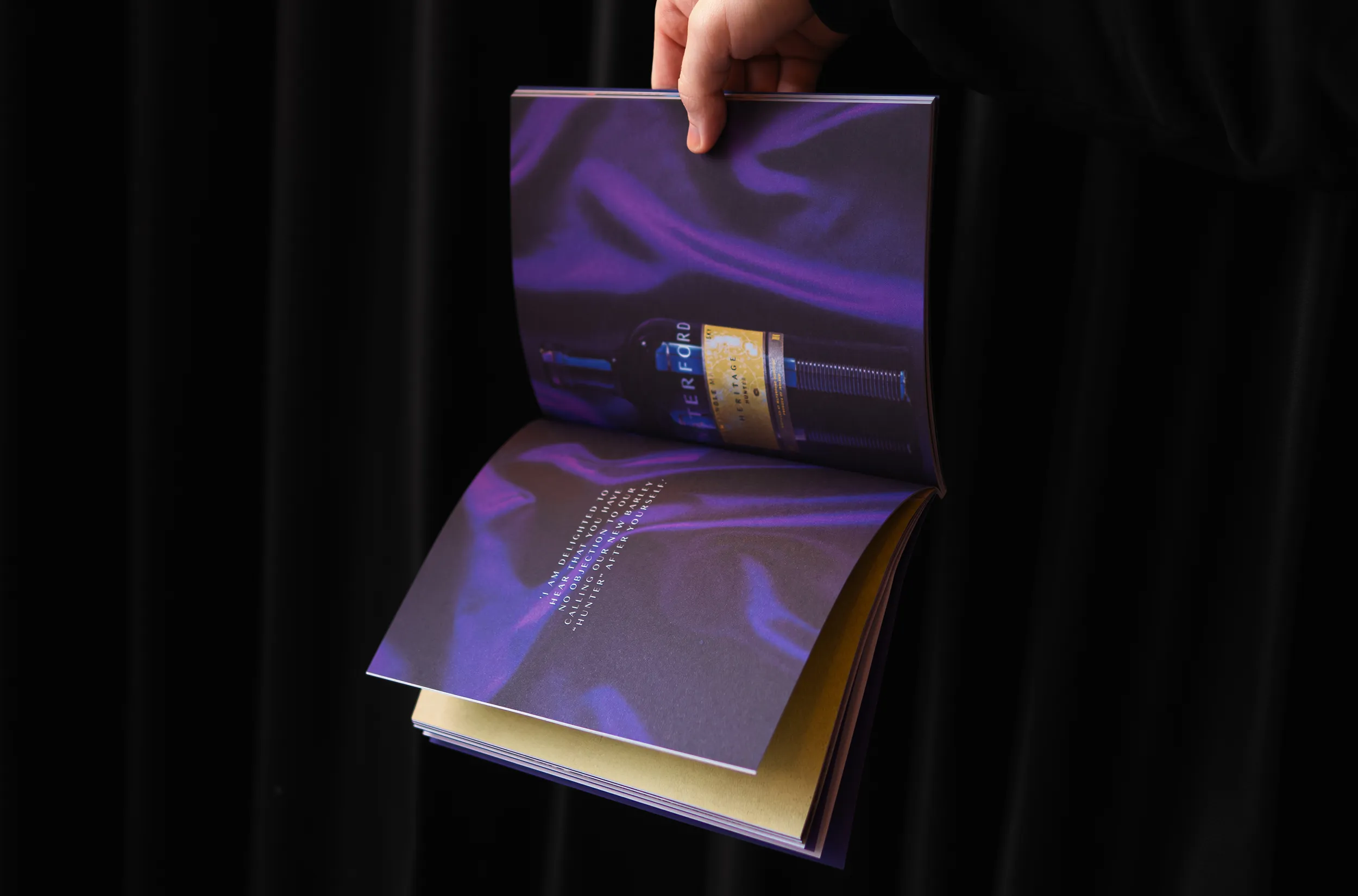
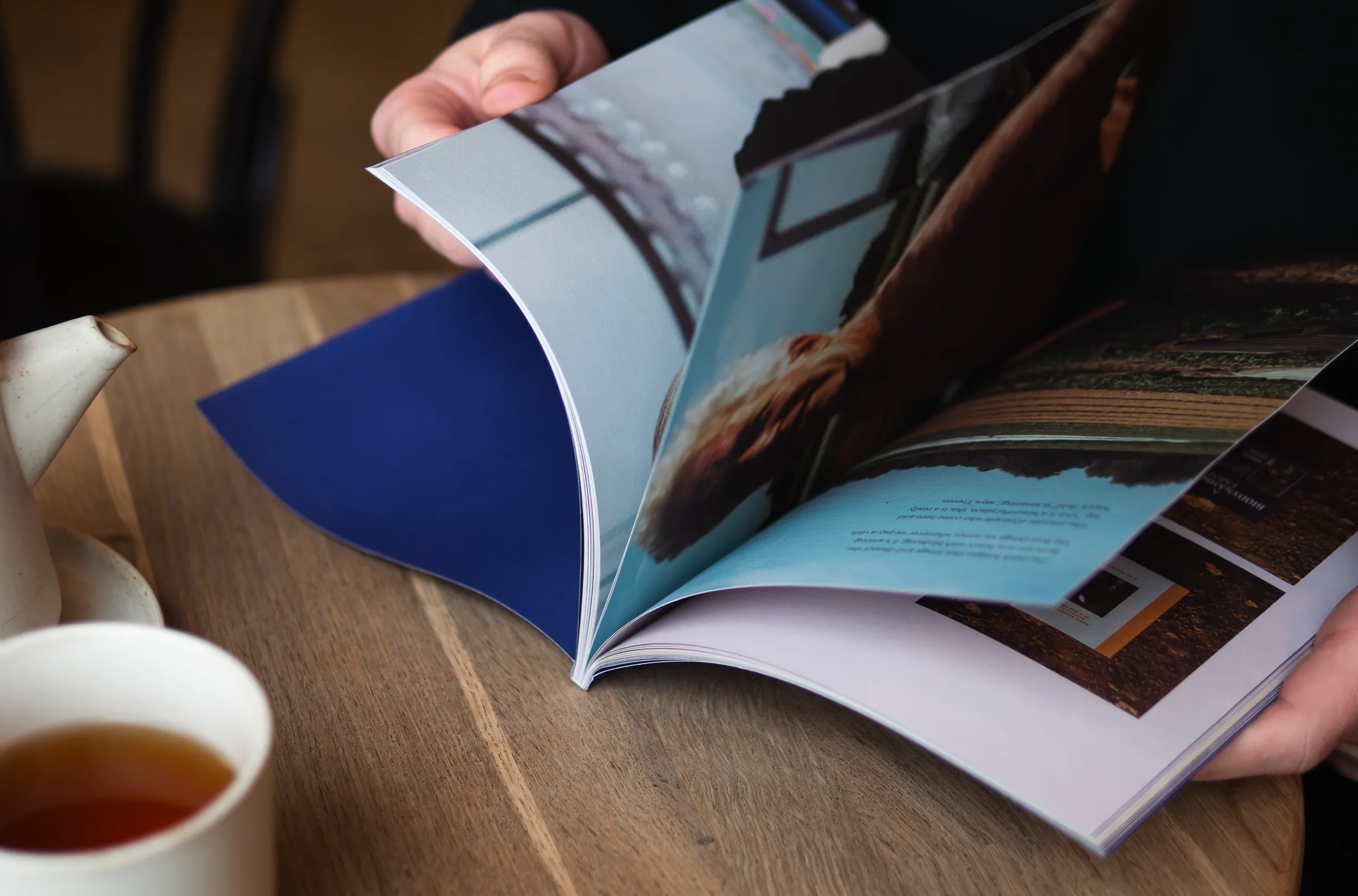
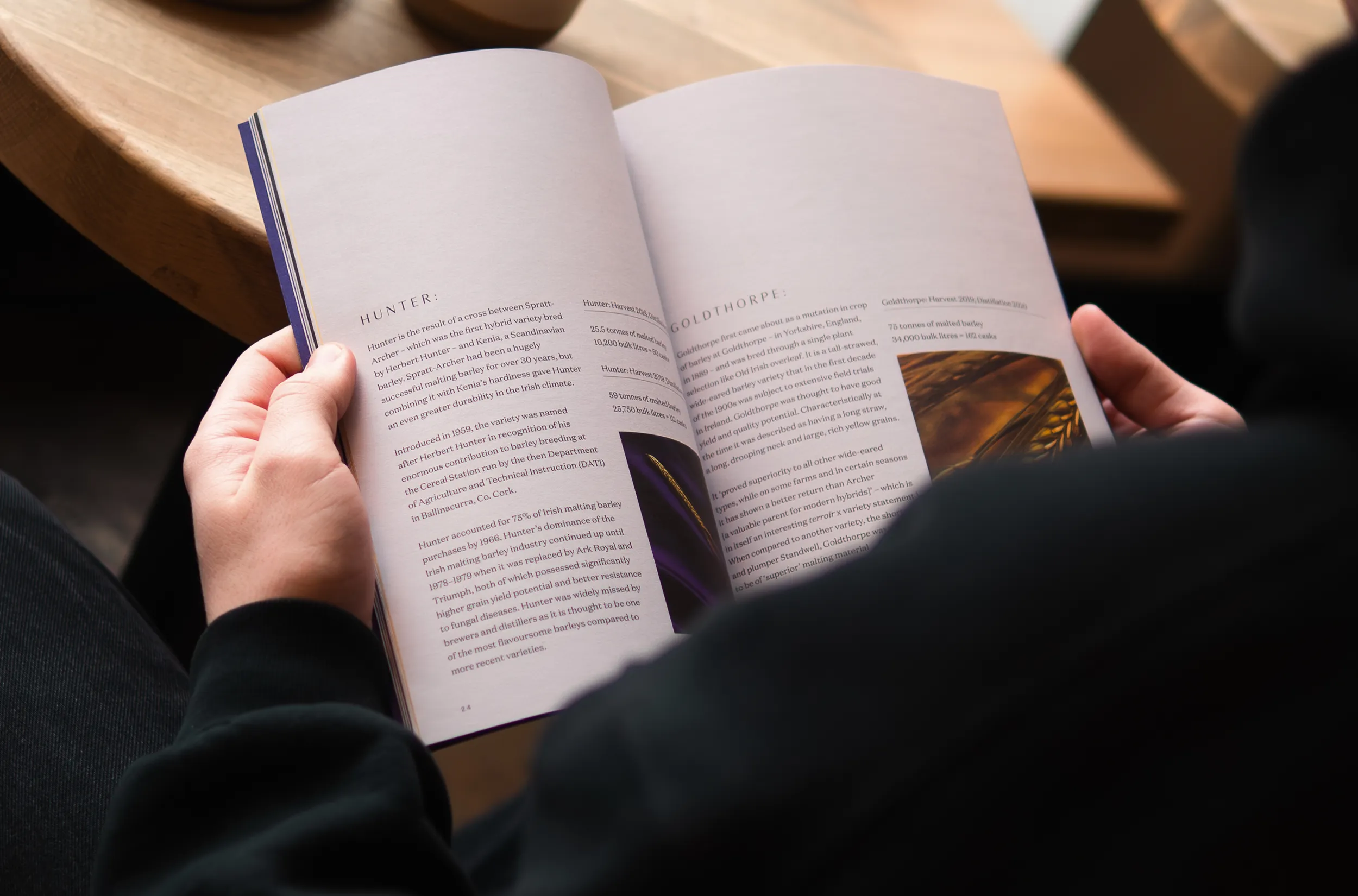
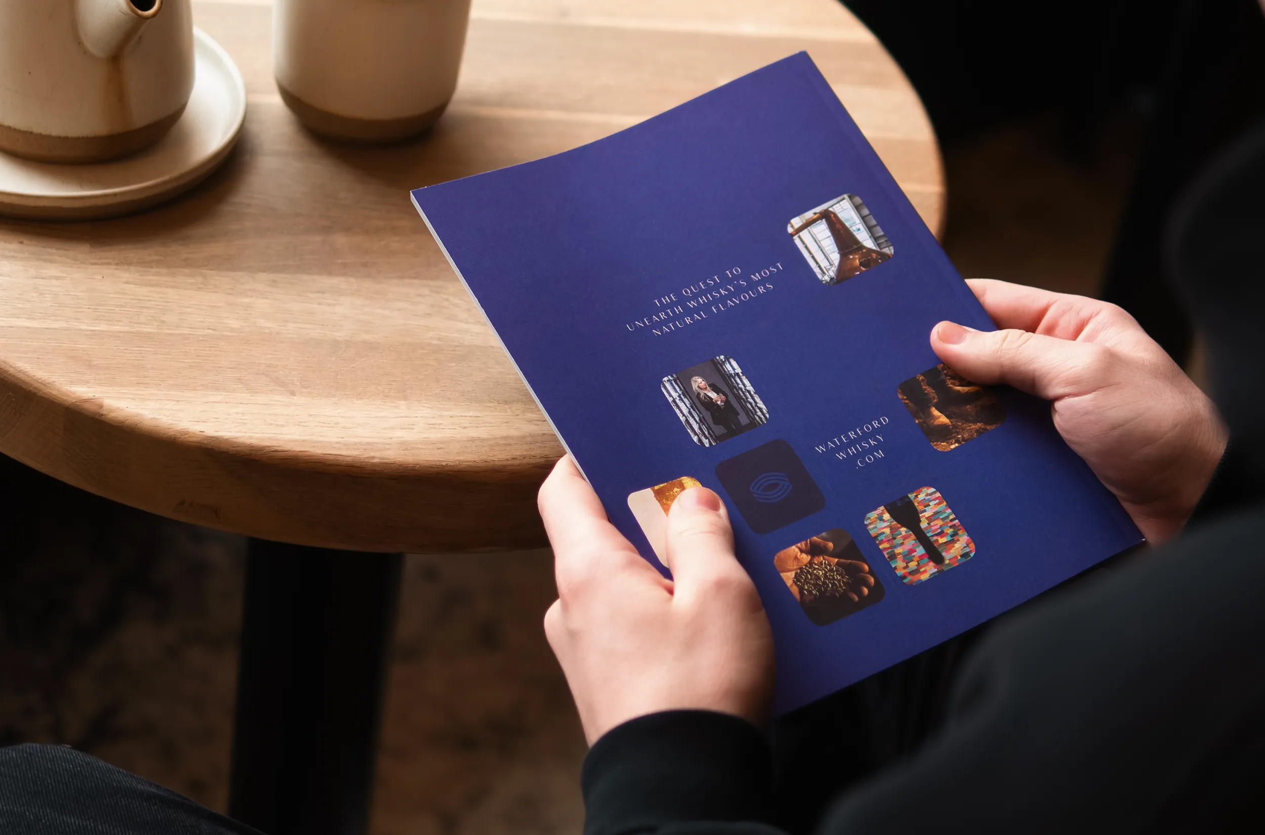
A philosophical journal, ELEMENTS: is an annual collection of writing centred around the agricultural case for natural whisky.
A compilation of musings on everything from organics, to heritage varieties, to small-batch malting. A rabbit hole for the curious whisky drinker to delve down. Printed this to share with their friends in the trade, and any visitors to the distillery who would like one.


Stationery:
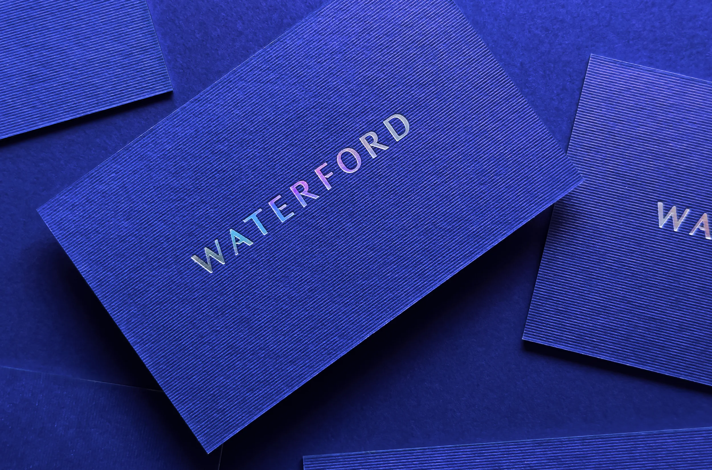
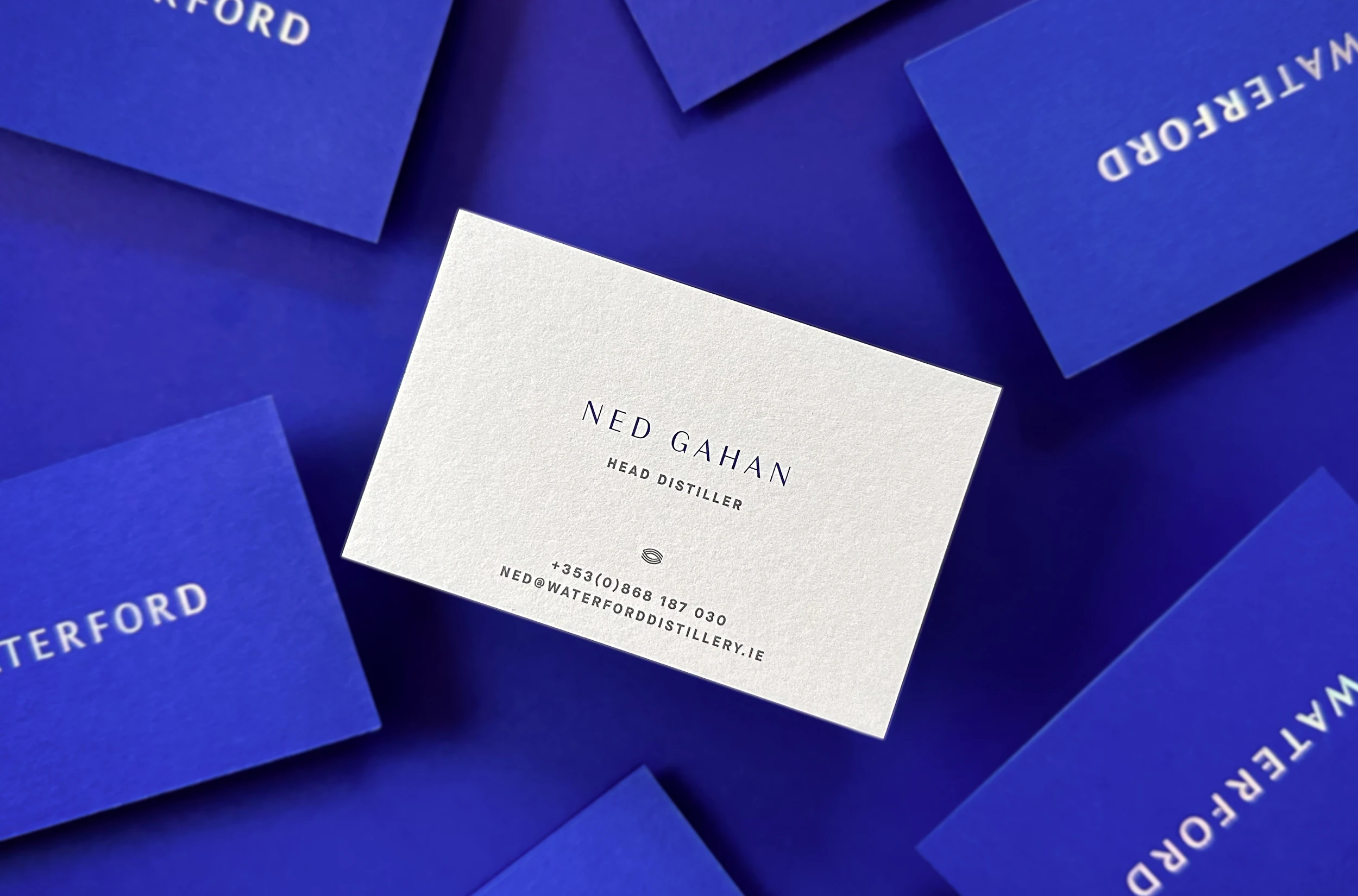
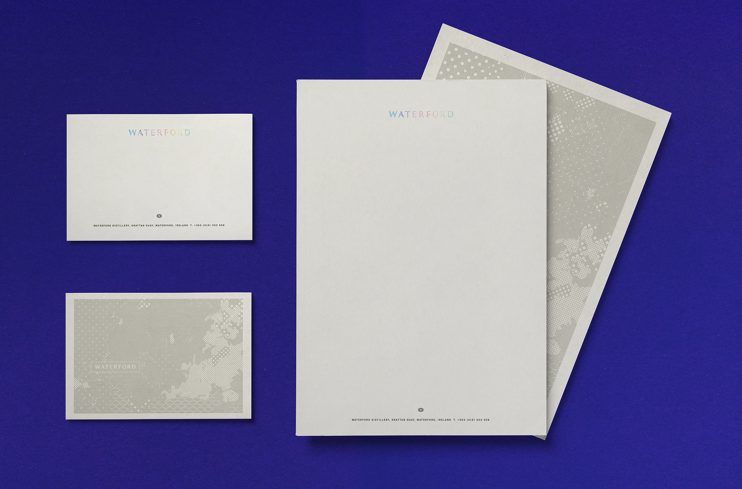
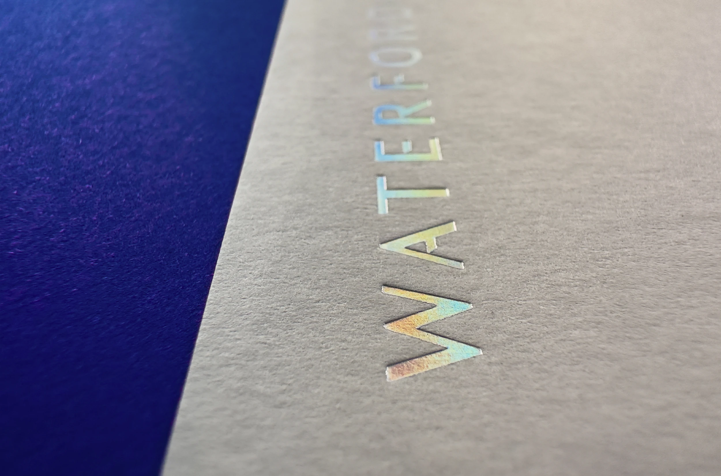
Waterford asked for their stationery materials to reflect the naturalness of their product, and deliver an understated physical connection. The solution was to focus on simplicity and natural materials. The stationery is printed on Colorplan papers with foil and pantones. The stylised map pattern is based on the farm map seen suspended above the distilling floor at the distillery itself. The business card is duplexed using an embossed material echoing the ridges seen on their bottle and building.
Teireoir Tasting Kit:
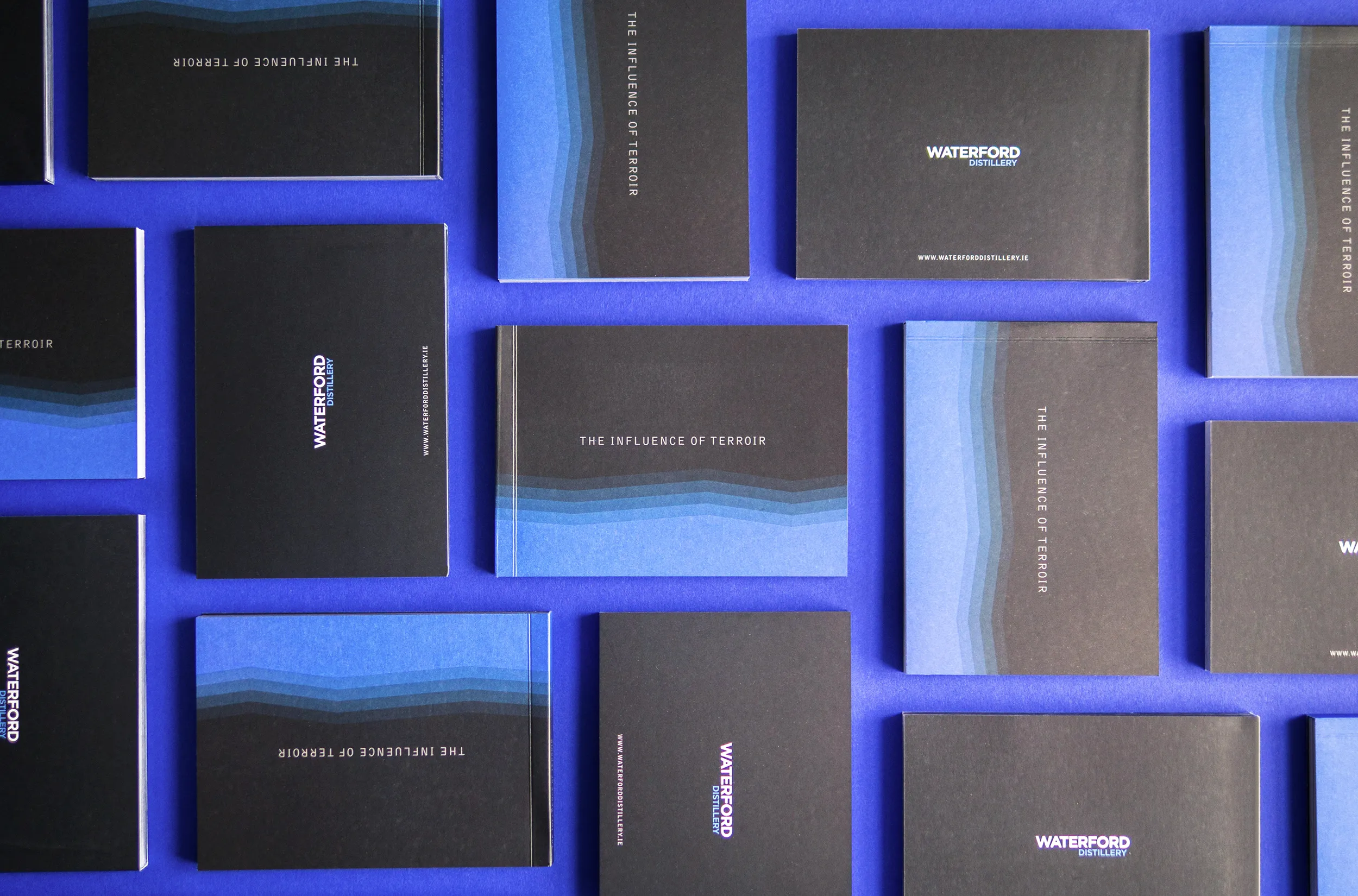
Waterford whisky methods of production are not like any other distillery in the world. Their terroir driven approach to whisky reveals unique flavours captured from the individual Irish farms where barley is sourced. They wanted to share samples of their whisky to allow people to appreciate these differences first hand. For the packaging it was important to reflect the truly natural product within. The ‘compare and contrast’ nature of the kit led our approach in a scientific direction. The final kit is a self sealing clamshell pack which clearly presents the bottles and also protects them in transit. Made from a wet moulded bagasse pulp the pack is fully recyclable and compostable.


Map of Provenance:
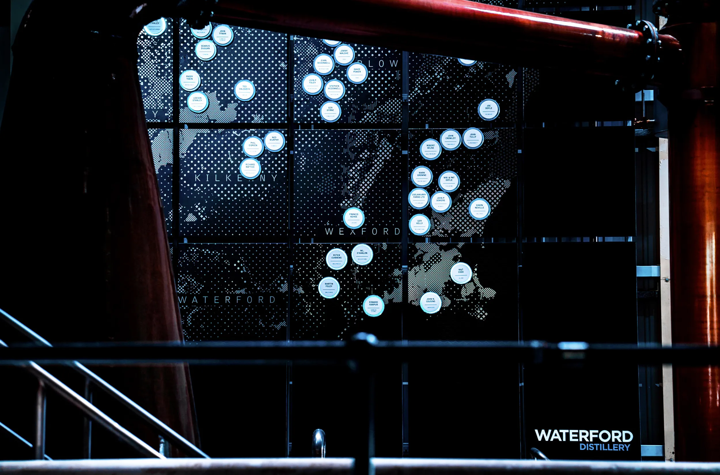
The provenance of Waterford Distillery’s barley, where and how it is cultivated is key to their entire philosophy. Taking their proven principles from Bruichladdich on Islay a giant step further, they have an unprecedented 46 Irish farms, some organically-run, growing barley on 19 distinct soil types. With a pioneering digital logistical system keeping track, each farmer’s crop is harvested, stored, malted and distilled apart. They can capture in spirit each farm’s terroir, that subtle character shaped by microclimate and soil. Individuality and integrity from field to barrel.
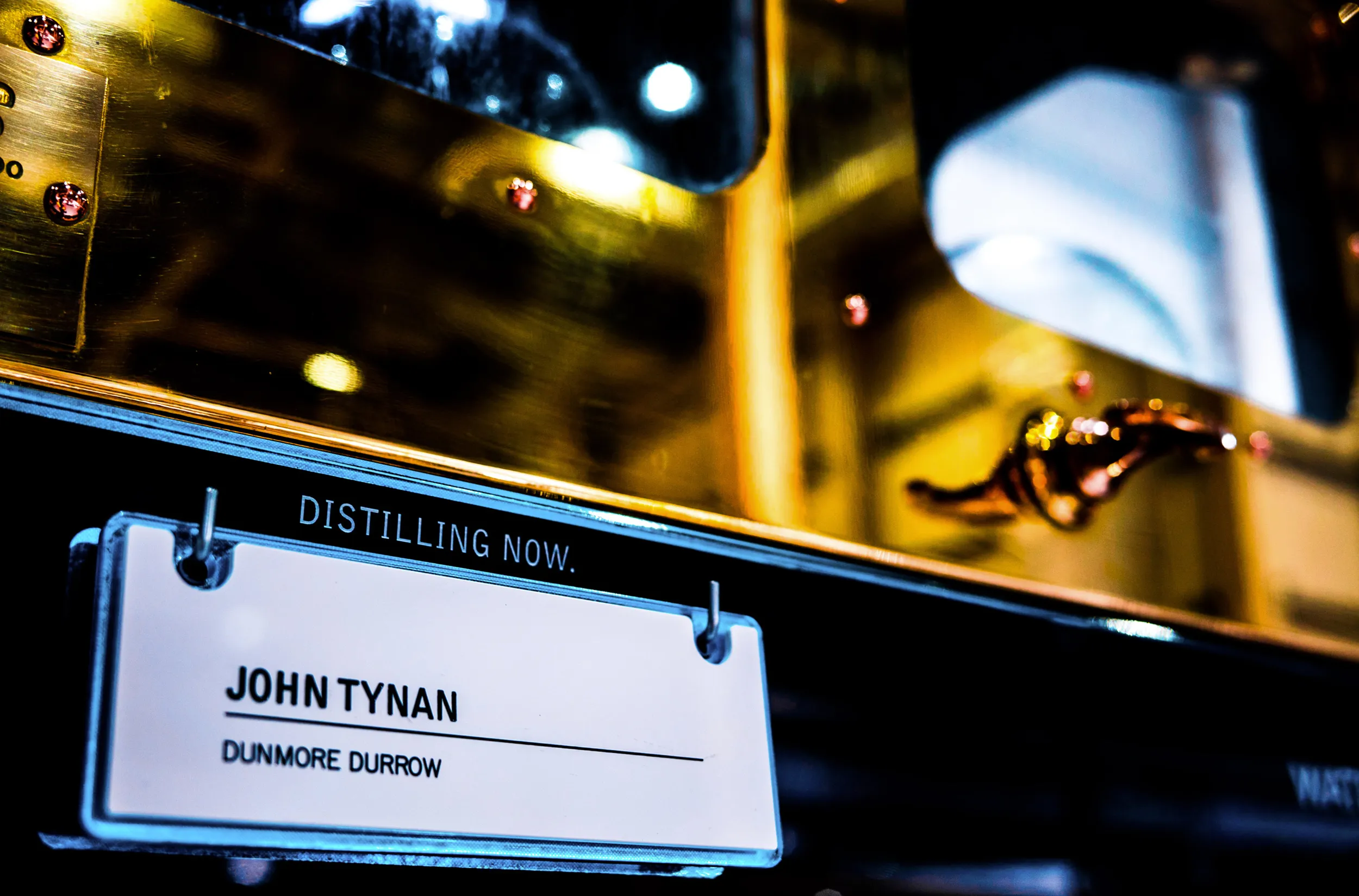
Our brief was to create a visual representation of this process via an installation in the stills room, which became the 'map of provenance'. As a starting point we were given a Soil Association survey map of the south east region. This was very complex and colourful, but not suitable for us to represent the concept. We wanted to clarify and bring focus to the farms themselves. We started by stylising the map into the separate soil types, each one was given a pattern of its own. Each barley farm is plotted on the map with a magnetic disc. This disc is lit up when that particular farm is being distilled. When required the farms can be easily removed and updated with new ones. The farm name is also hung on the spirit safe as it is being distilled. Measuring 25sq metres it is a clear reminder of the significance of their unique process.
Whisky Flavour Visualisation:
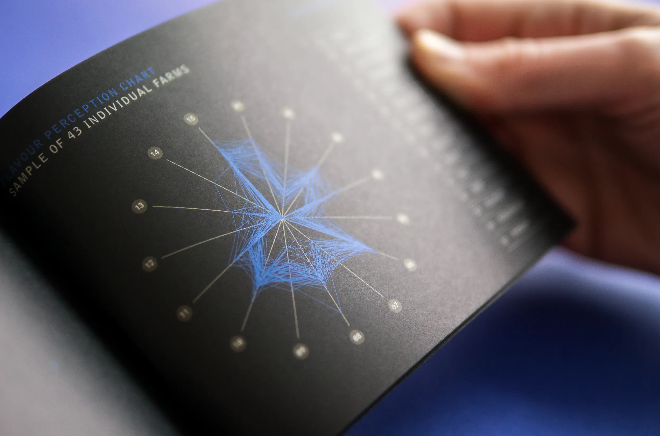
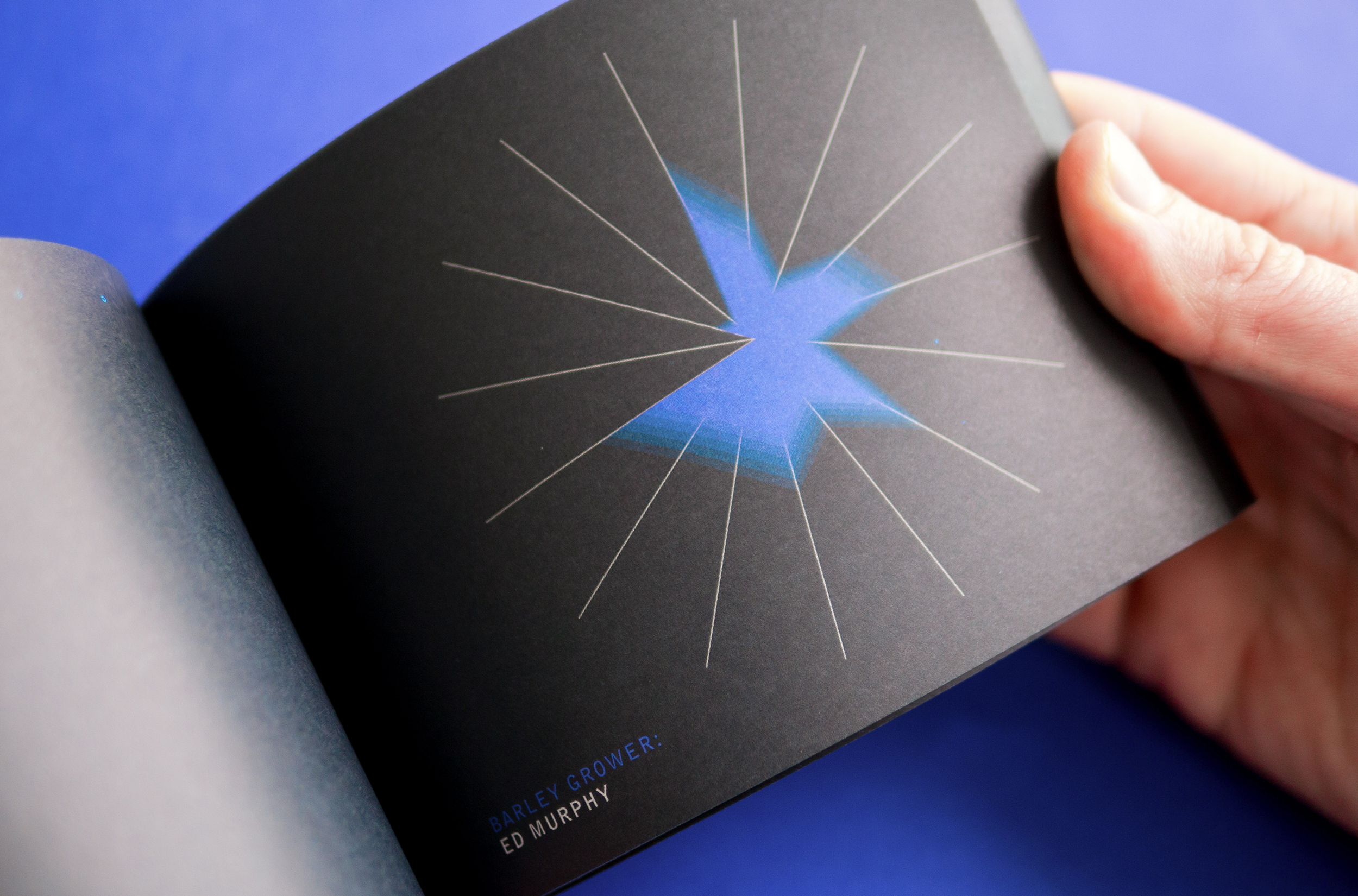
Waterford Distillery is producing a terroir-derived, single malt Irish whisky. The brief was to illustrate proof that the flavour of the distillery’s whisky is influenced by the particular land or farm on which the barley is grown. To do this, we re-interpreted scientific flavour profile charts to create a bespoke diagram style.
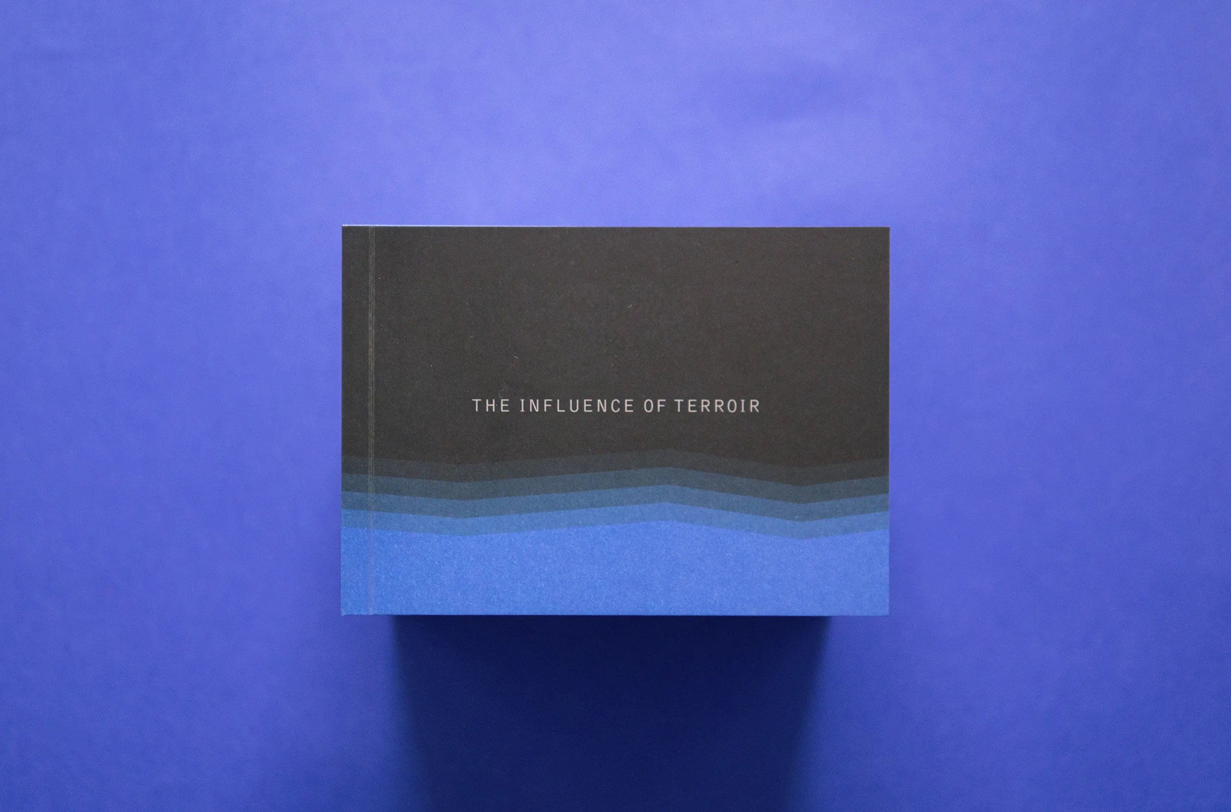
To appreciate the difference in flavour between each farm’s whisky, we stylised the charts and created an animation sequence. The blue morphing shape depicts the individual flavour profile of each farm. Each spoke refers to a different characteristic identified within a single farm’s spirit which combine to build up a flavour profile for each distillate. No two profiles are alike. The animation helps convey this difference with a hypnotic flow and soundtrack. The profiles were rolled out into an animation and a flip book, and will be projected inside the distillery building itself.
→ IDI Award Winner

Outputs: Brand Identity / Packaging / Apparel / Printed collateral / Animation
Explore more:
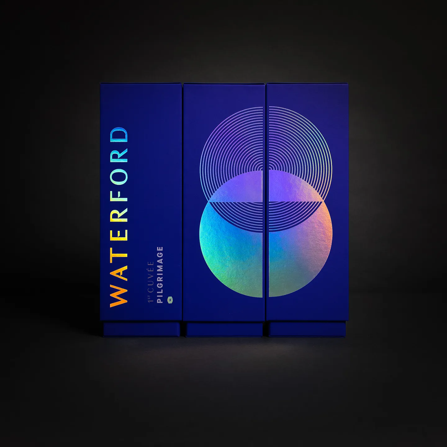
Waterford Whisky:
The PilgrimageLaunching a challenger brand
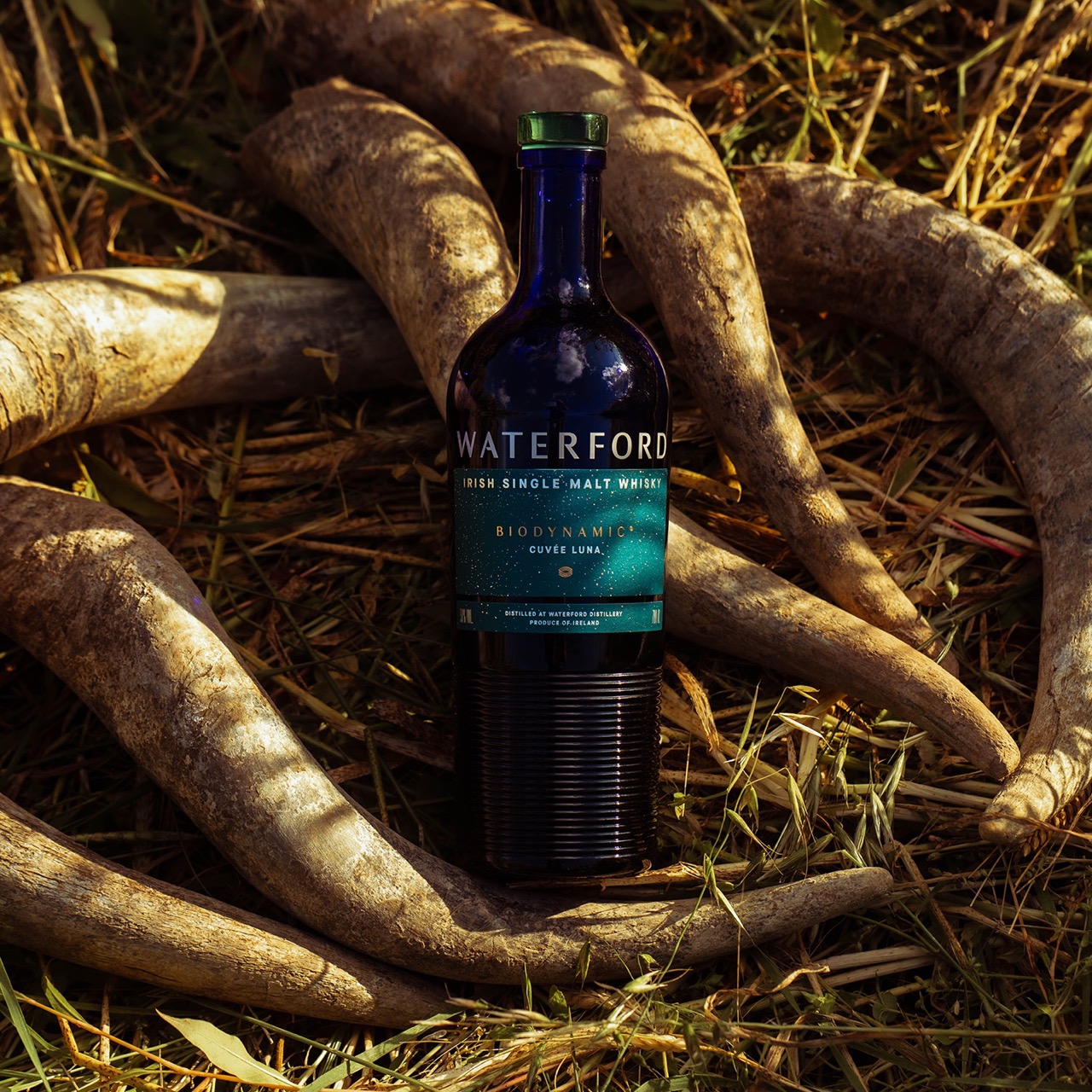
Waterford Whisky:
Product Range DesignCreating distinction

Seagull
BakeryThe original artisan bakery
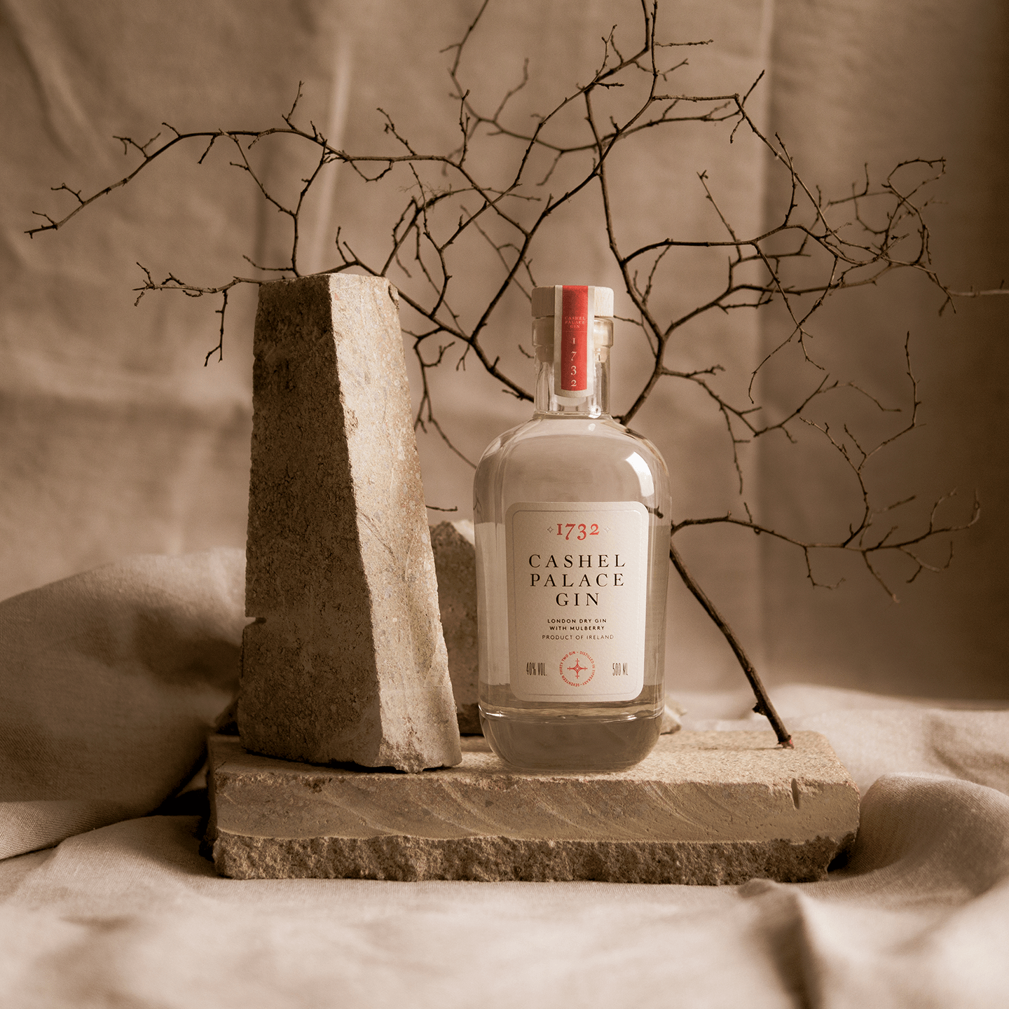
Cashel Palace
1732 GinChannelling heritage

Waterford
Gallery of ArtHousing the city collection

Trade
CoffeeOpening a café & barista school
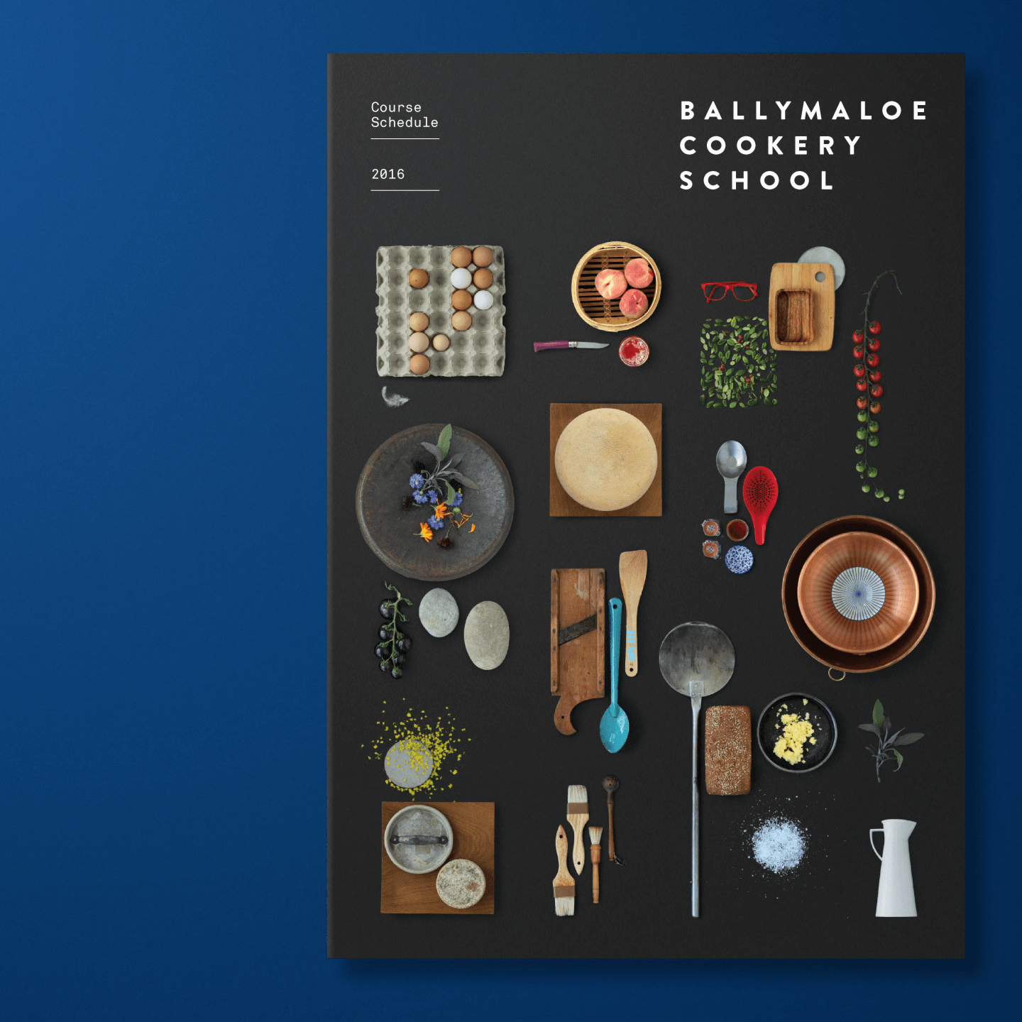
Ballymaloe
Cookery SchoolCommunicating an ethos

Renegade
RumLaunching Caribbean Cane Rum

Nearform
SoftwareTransformative branding scheme
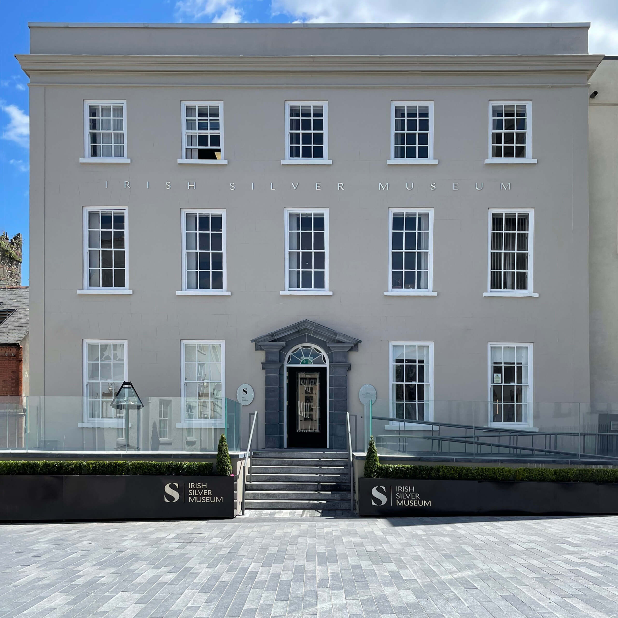
Irish Silver
Museum1000 years of Irish history

CakeFace
PatisserieBranding out of this world creations

Stafford
BondedCreating a face for a 130 year old family business

Ballymaloe
LitfestCreating festival alchemy

Collateral
Media ProductionVideo production agency

dhb
ArchitectsComposing a design-driven architectural firm

Document
FilmsProjecting a documentary and film studio
Ardkeen
Quality Food StoresRepresenting community and artisanal produce
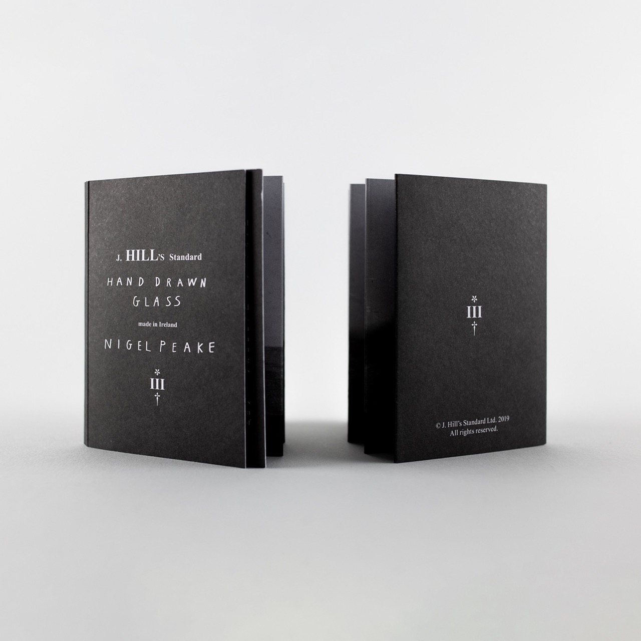
J.Hill's
StandardHand drawn crystal

Cake
FactoryRepresenting artists in NYC
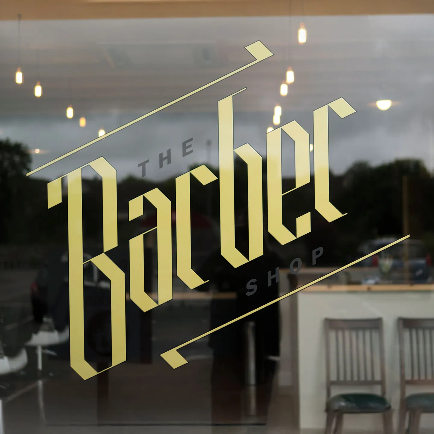
The Barber
ShopChoppy rebrand for new store

Invader
OperaThe first opera in 200 years
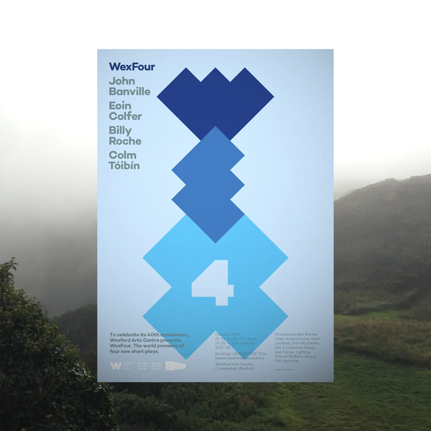
Wex
Four4 x Literary giants short plays

Loko
RestaurantBringing local to the neighbourhood

TRM
ClothingRebrand of a family store

Formula 4
Car liveryInterpreting speed
Established 2011 © Copyright TrueOutput: All rights reserved.