Wexford
Festival Opera
We were engaged to rebrand the 73-year-old Wexford Opera Festival. There was a drive to move forward and develop a more progressive solution that could broaden appeal and handle the demands of it required today.
We centred around the idea that when we truly engage with something like a festival, it becomes an immersive experience. Connecting people, the environment and live performance. To immerse, you connect with all aspects with a heightened awareness and it becomes a portal to another space.
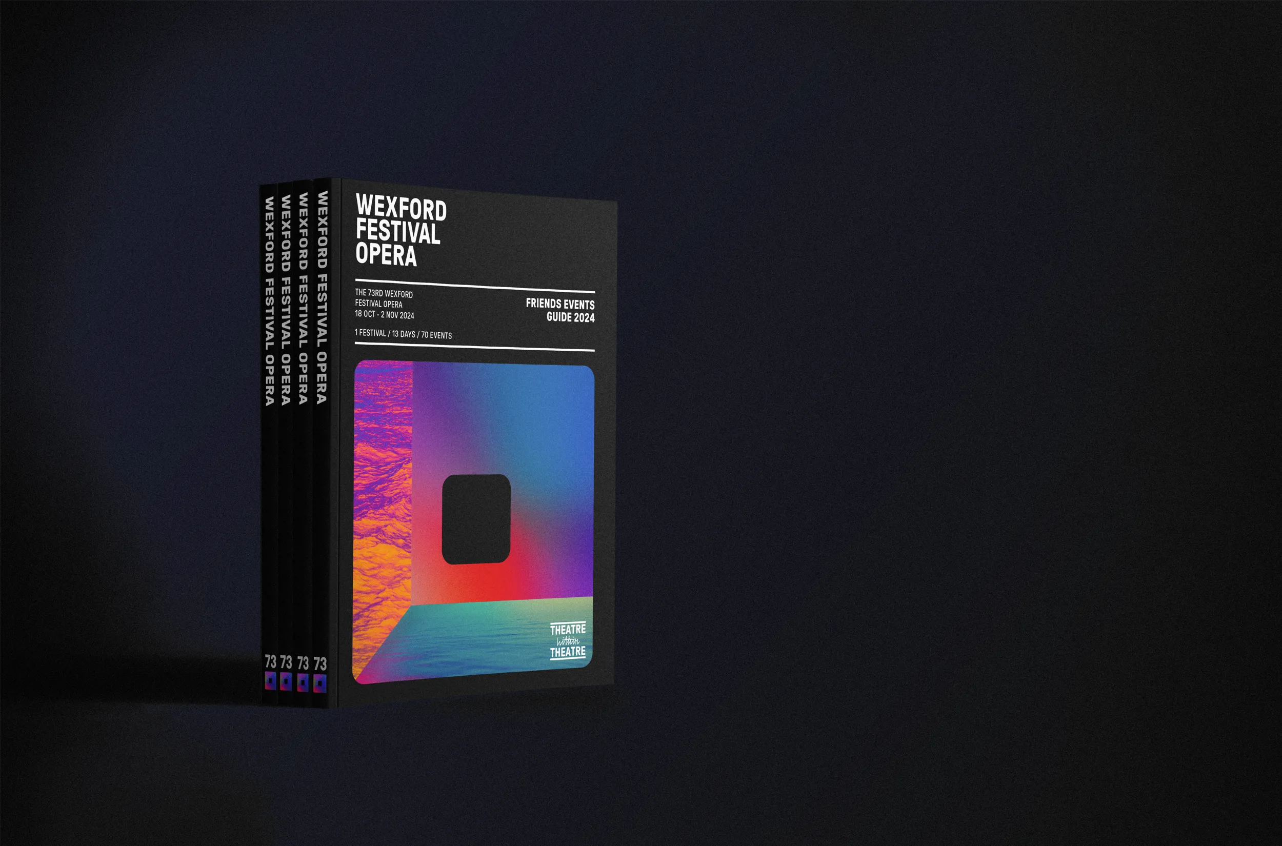
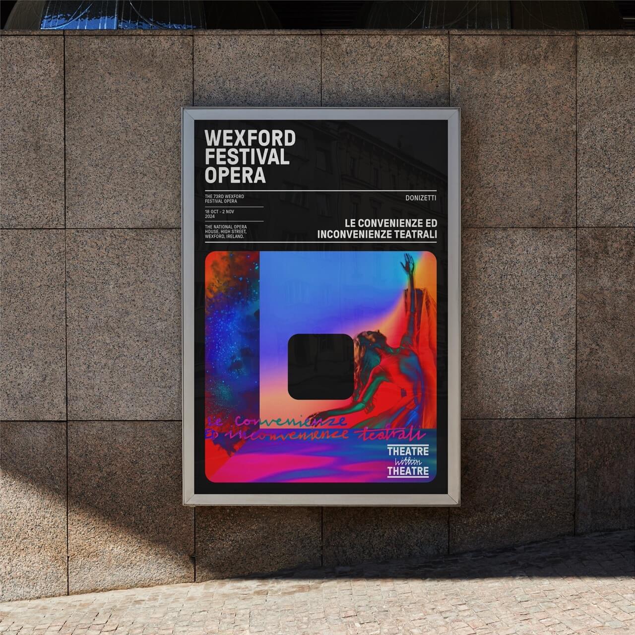
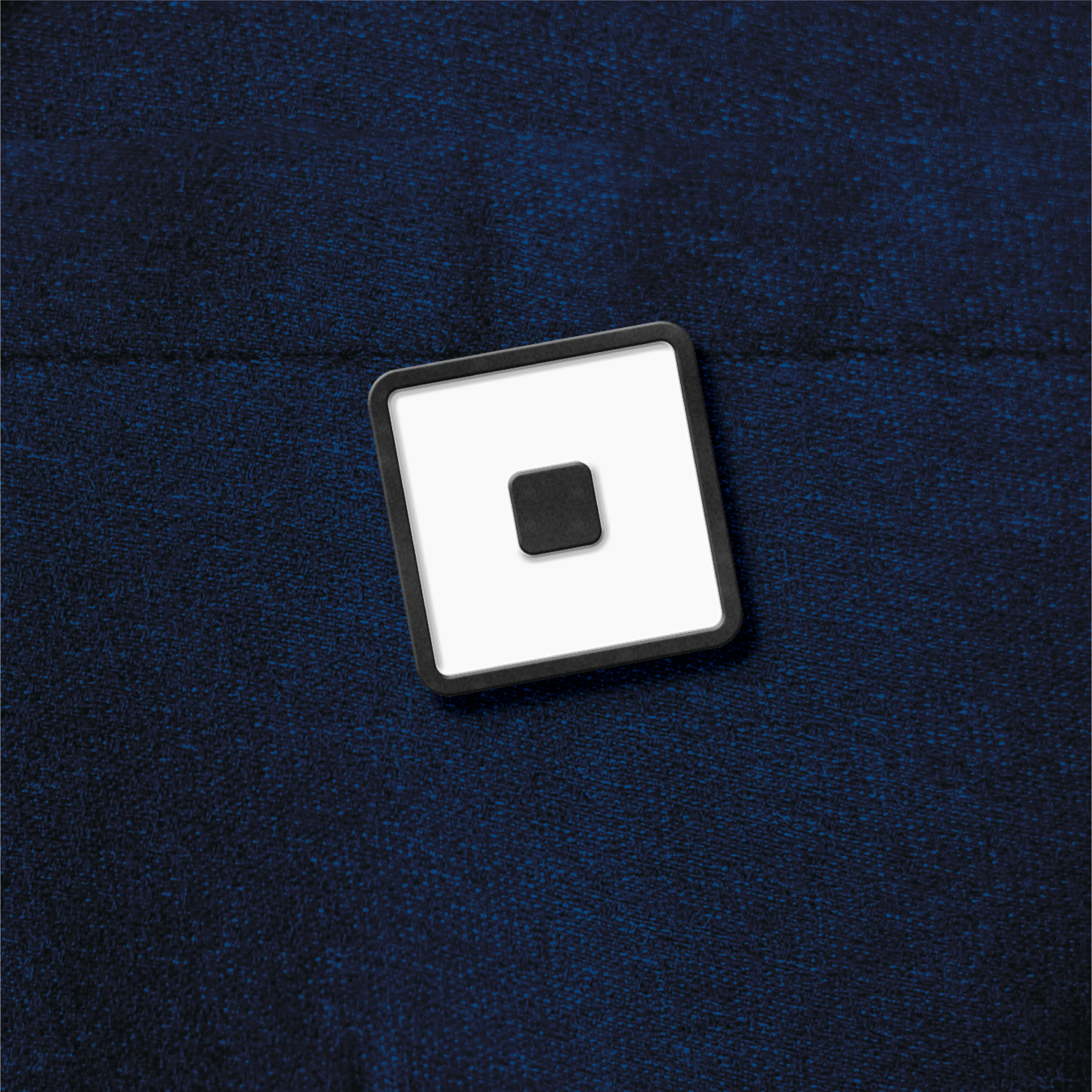
To represent the festival, we sought to create a strong symbol. We noted that the letter "O" for opera resembles a singing mouth. Additionally, architectural drawings revealed that the opera house stage is a square shape in all directions - a perfect 3-dimensional cube. This led us to create a square "O" as a distinctive symbol that connects both the singer and the stage. This "O" then becomes a portal for immersion and a device to hold imagery and film.
This theme was central to the 2024 festival imagery, where we created a 3D space inside the portal "O" drawing the audience into a theatre within the theatre. The use of ultra-vivid colours references the wide range of emotions in opera, from cold-blooded murder to unbridled passion. The imagery unifies a broad range of concepts, building recognition for the festival across all touch points.
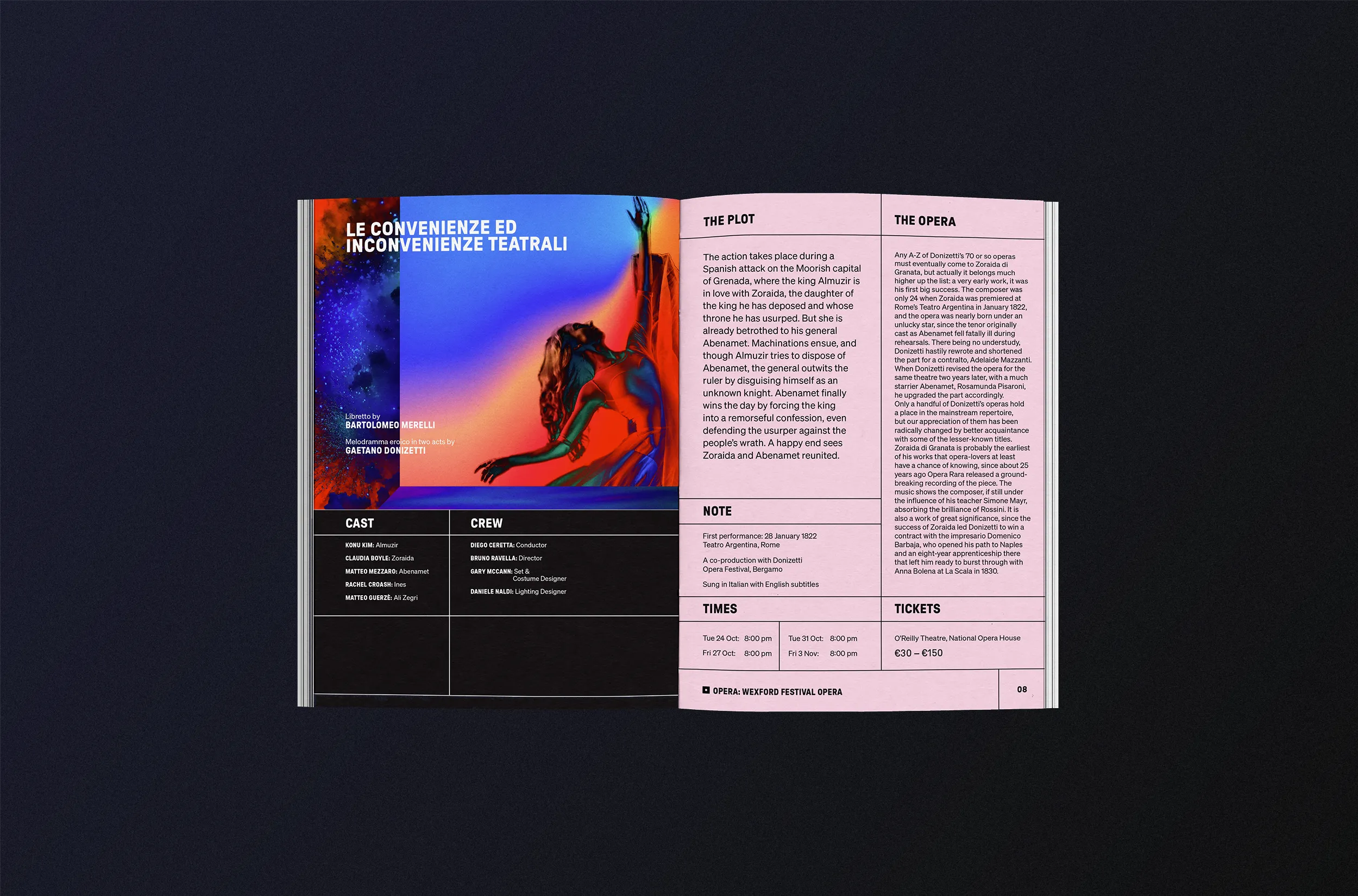
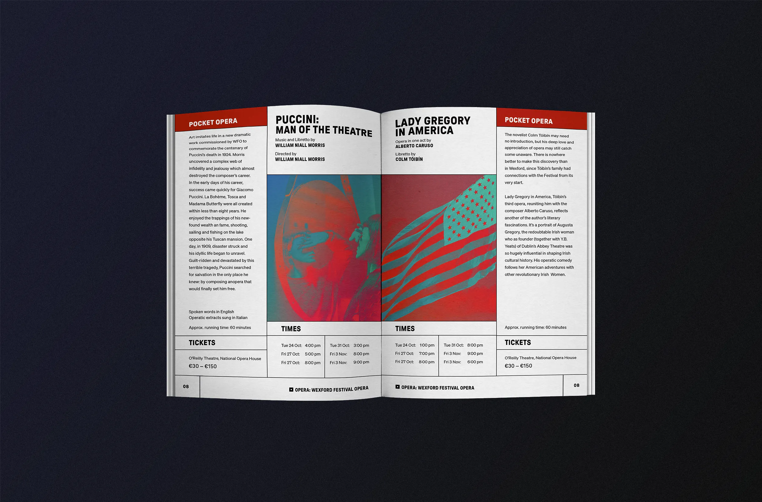
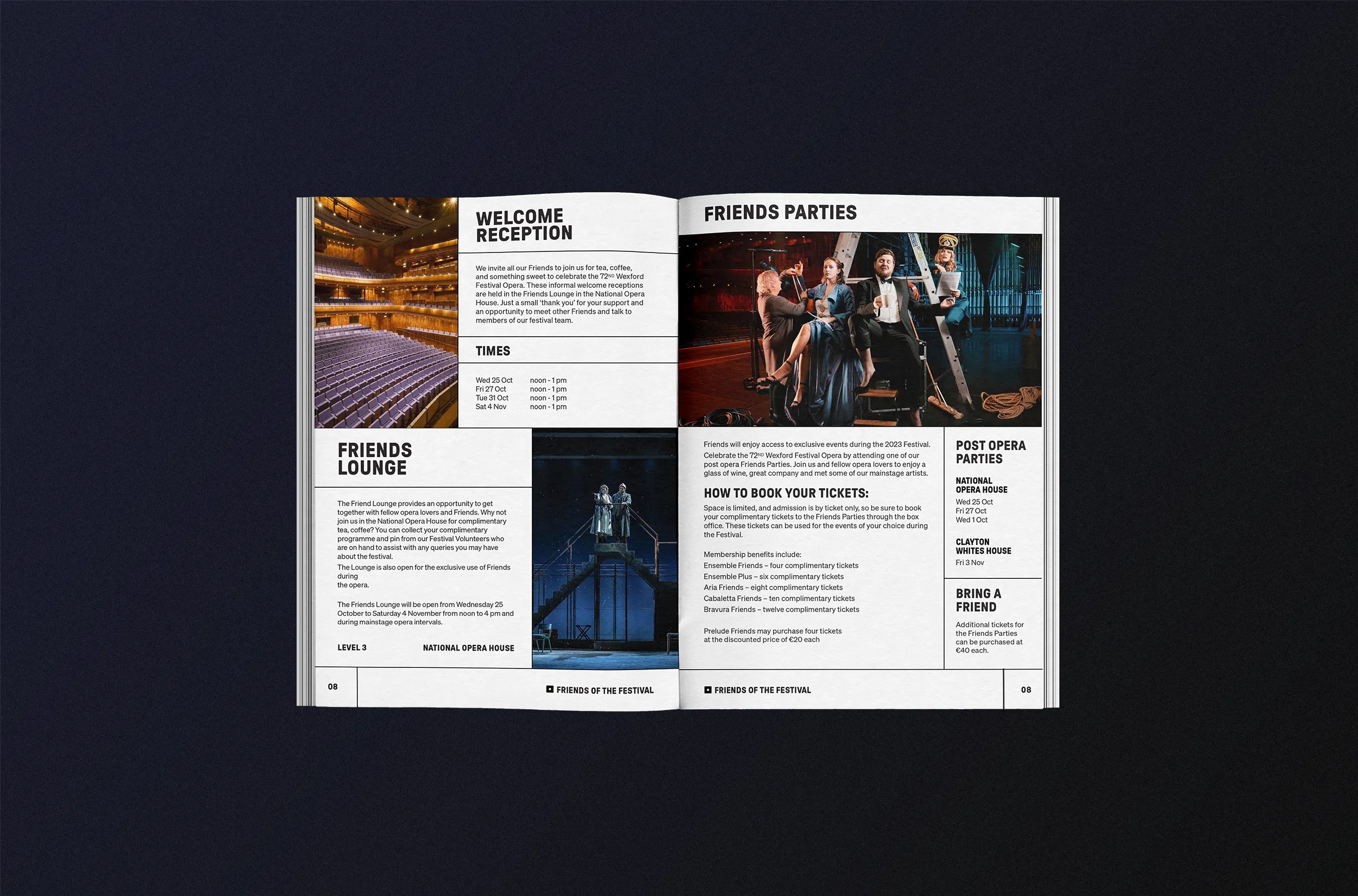
The design system incorporates a visible grid structure, creating a consistent and distinctive look for printed materials. This framework allows the in-house team to easily create marketing materials, integrating each season's imagery theme while maintaining visual consistency year after year.
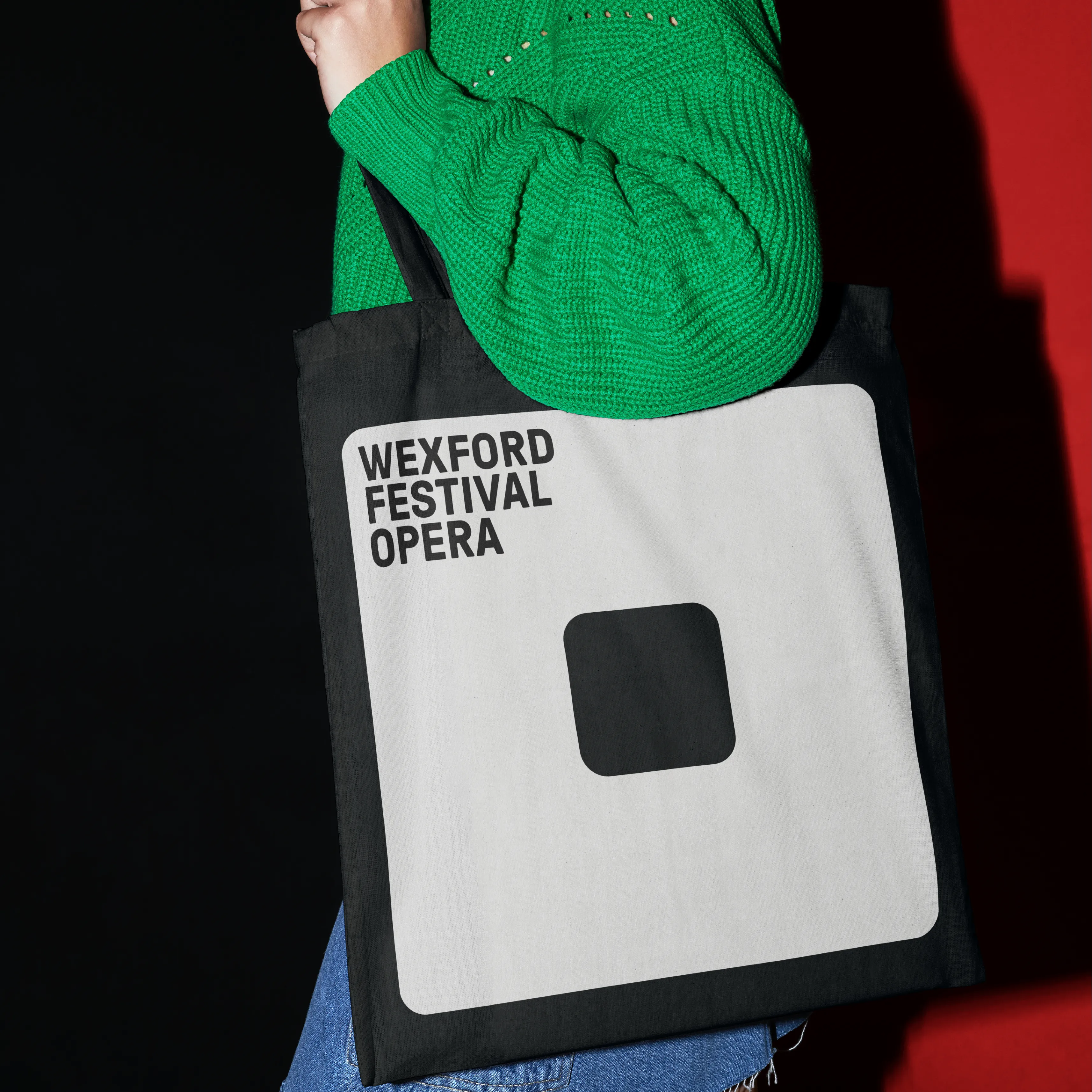
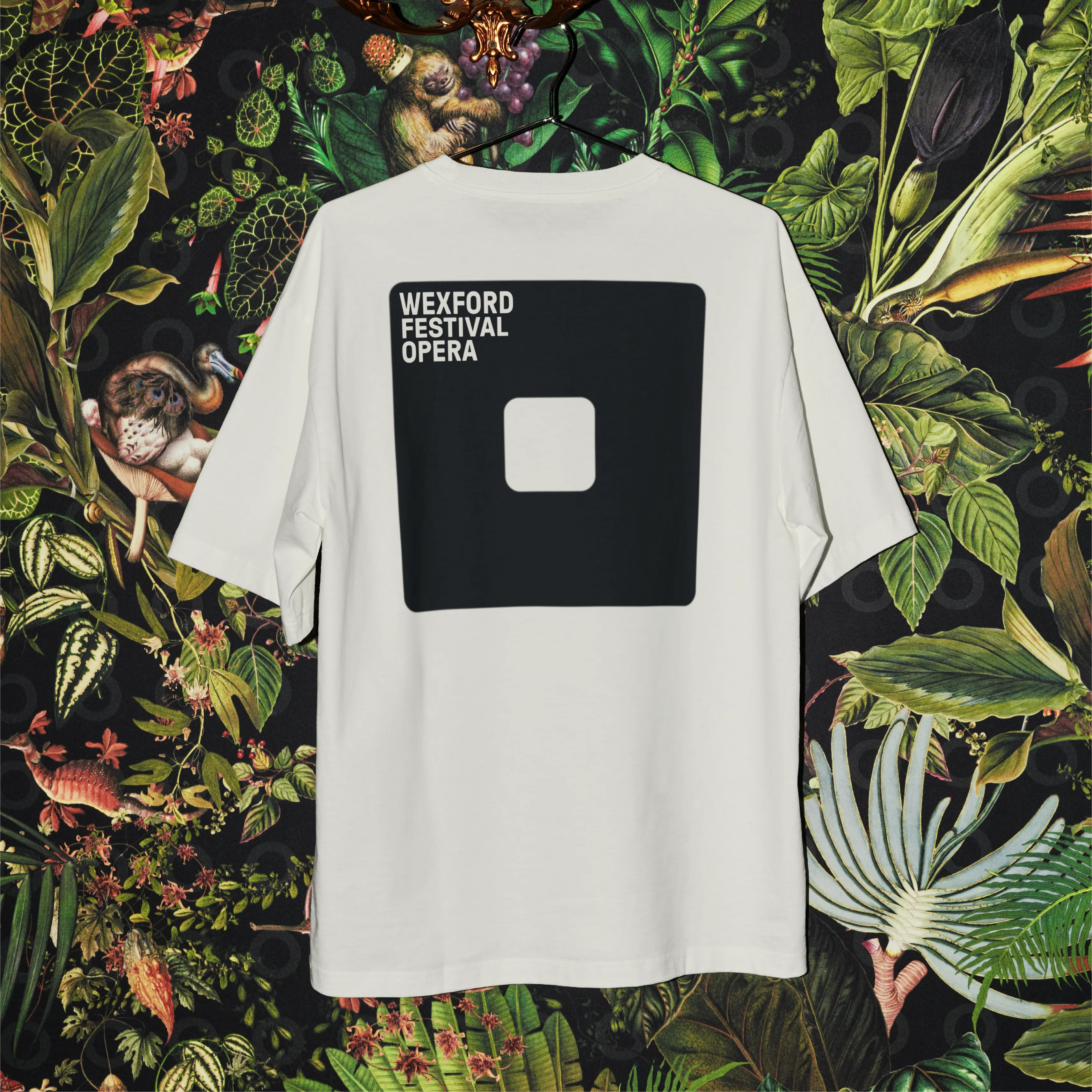
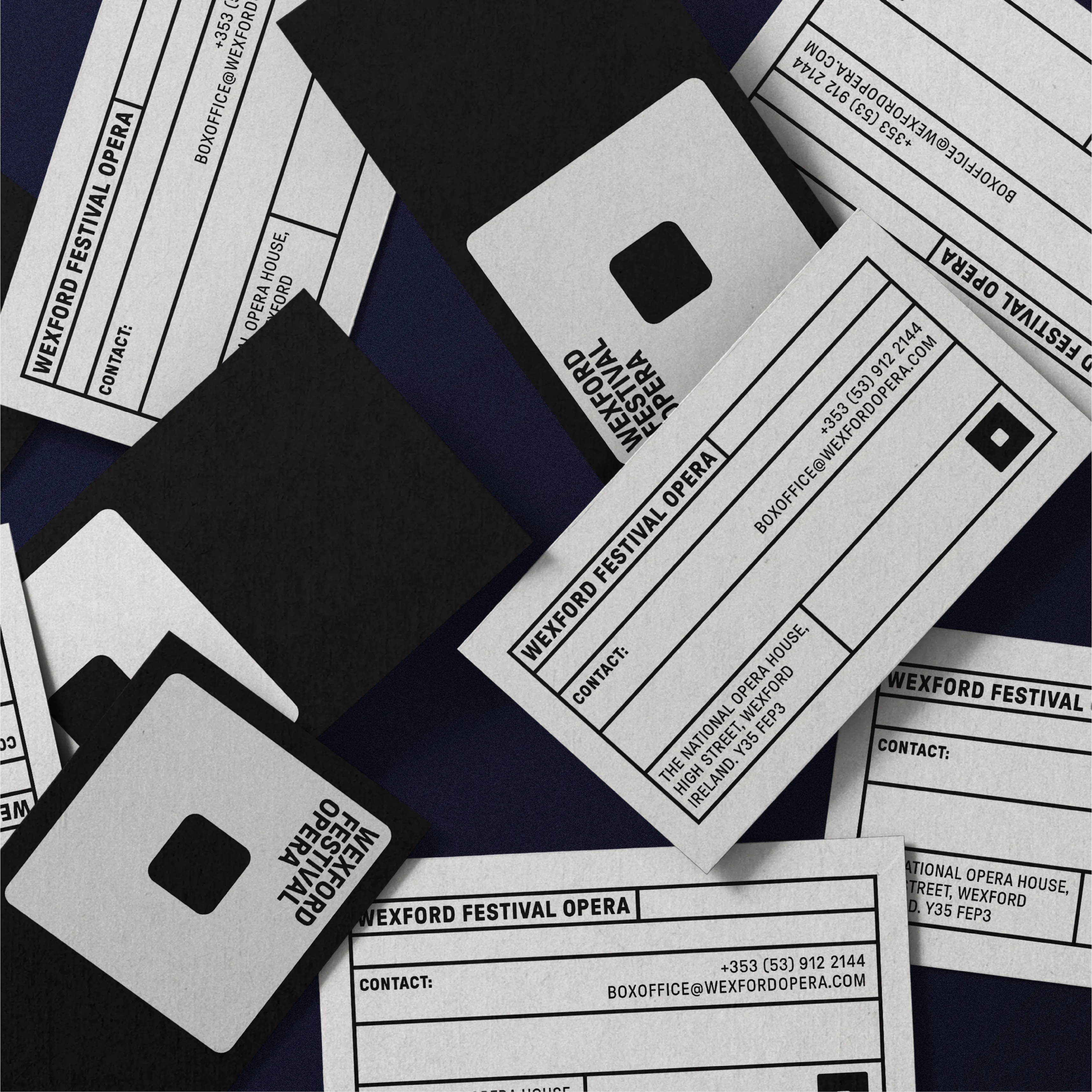
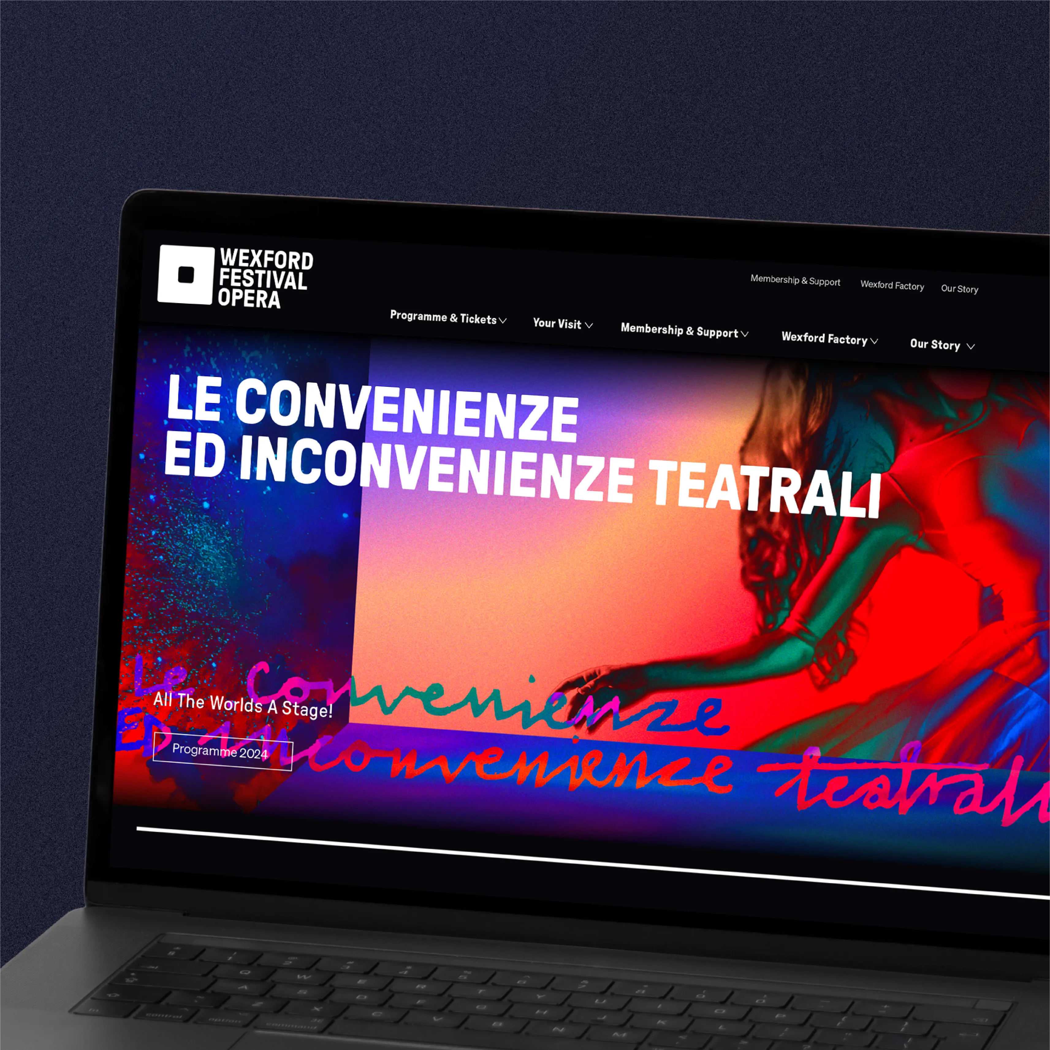
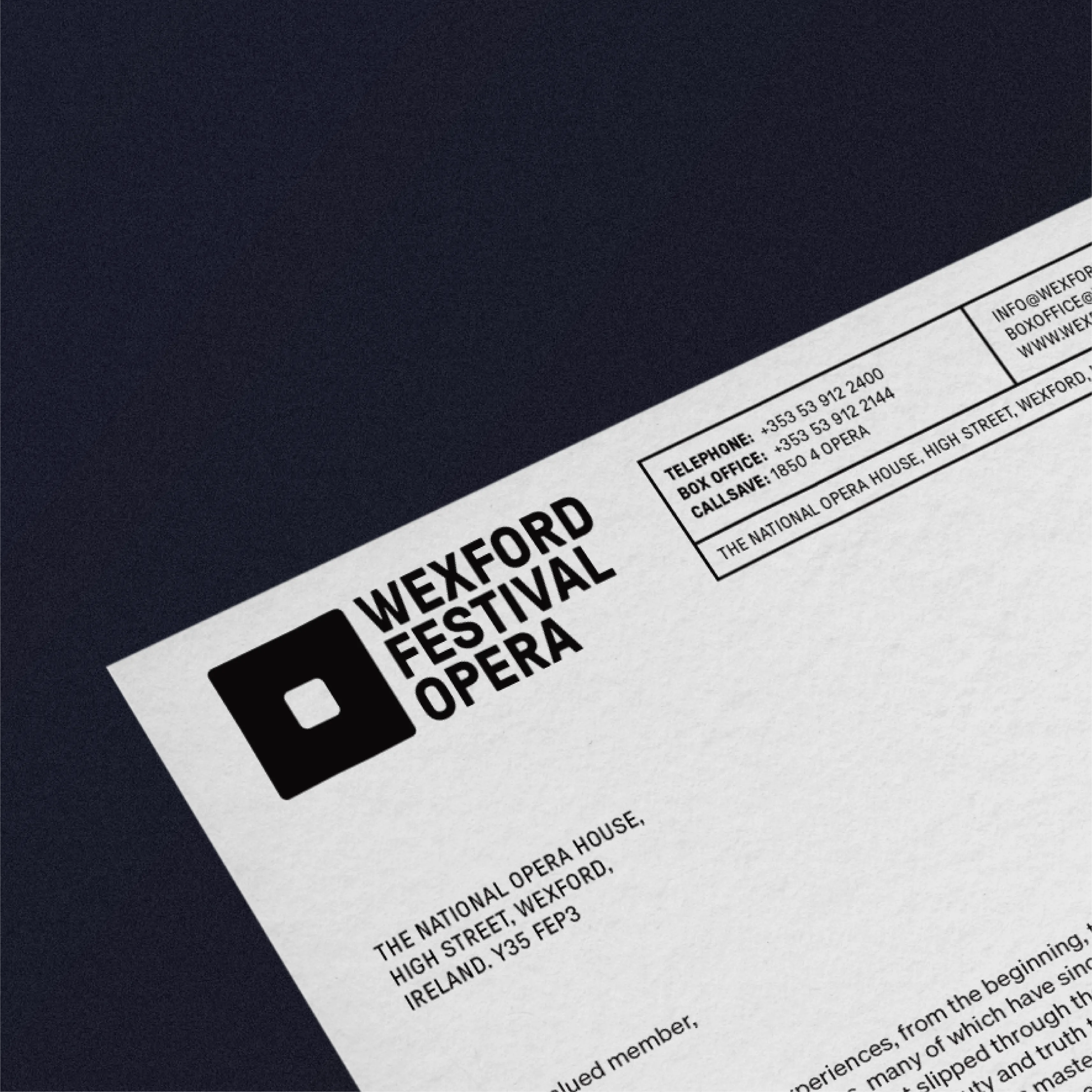
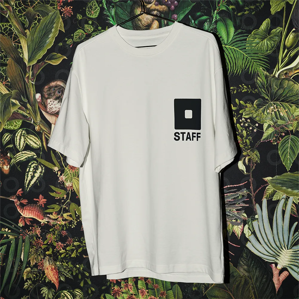
Outputs: Brand Identity / Brand Guidelines / Apparel / Digital / Animation / Printed Collateral
Explore more:

Buíon
Phort LáirgeConnecting our communities
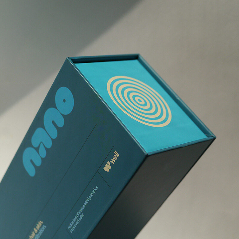
Nano
ShowerWellness with difference
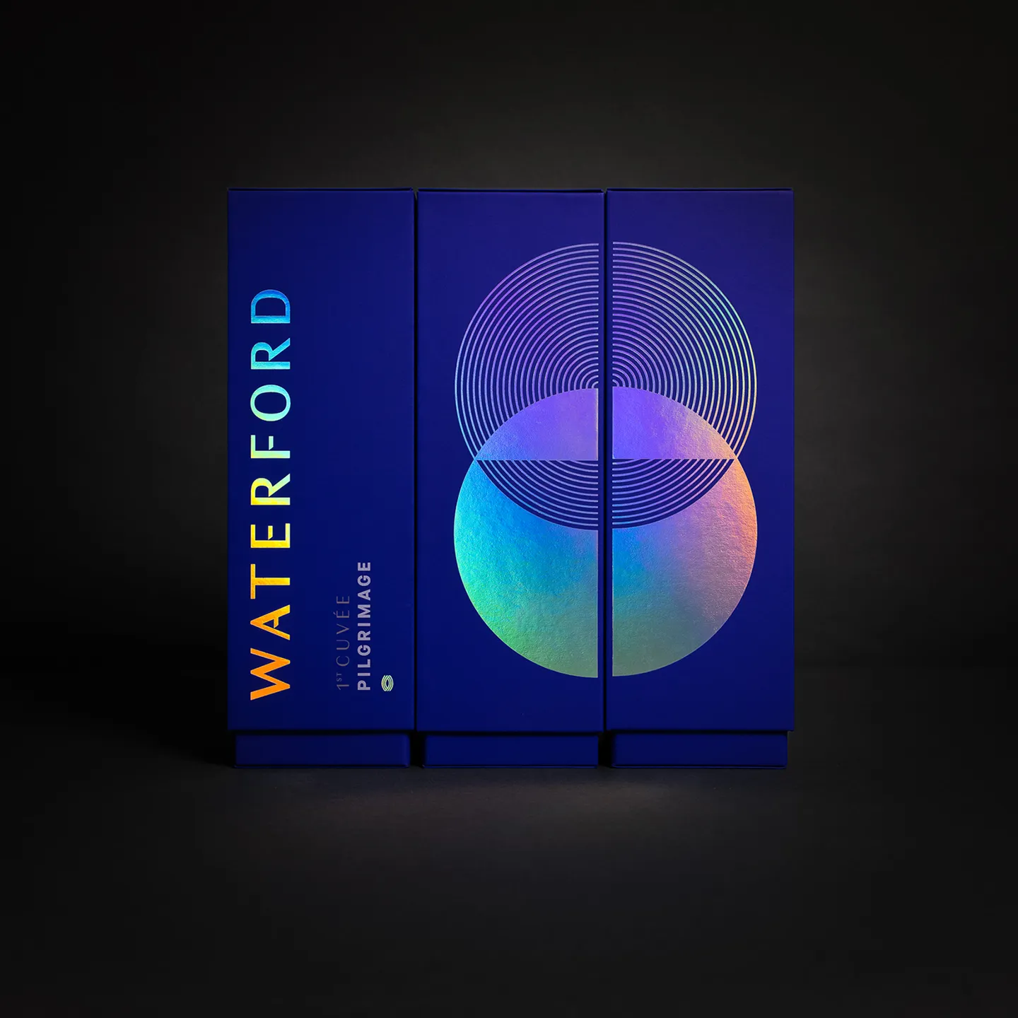
Waterford Whisky:
The PilgrimageLaunching a challenger brand
Waterford Whisky:
Product Range DesignCreating distinction

Seagull
BakeryThe original artisan bakery
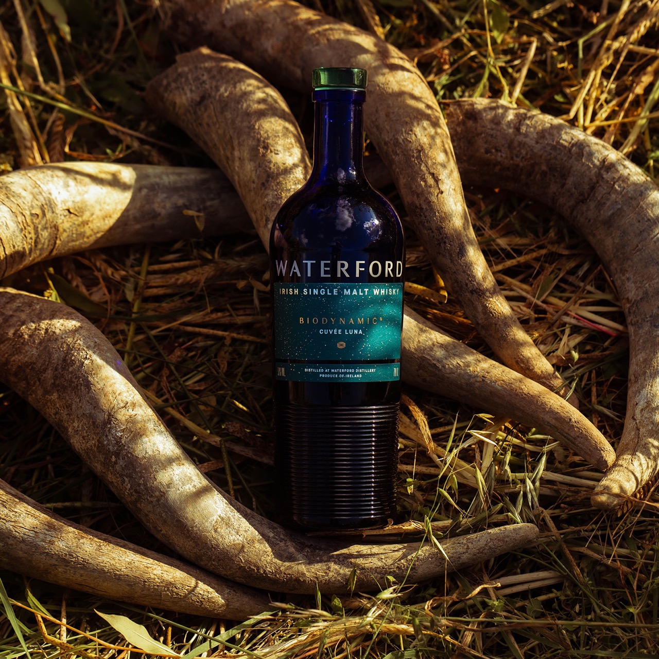
Waterford Whisky:
Selected WorksCrafting a brand world
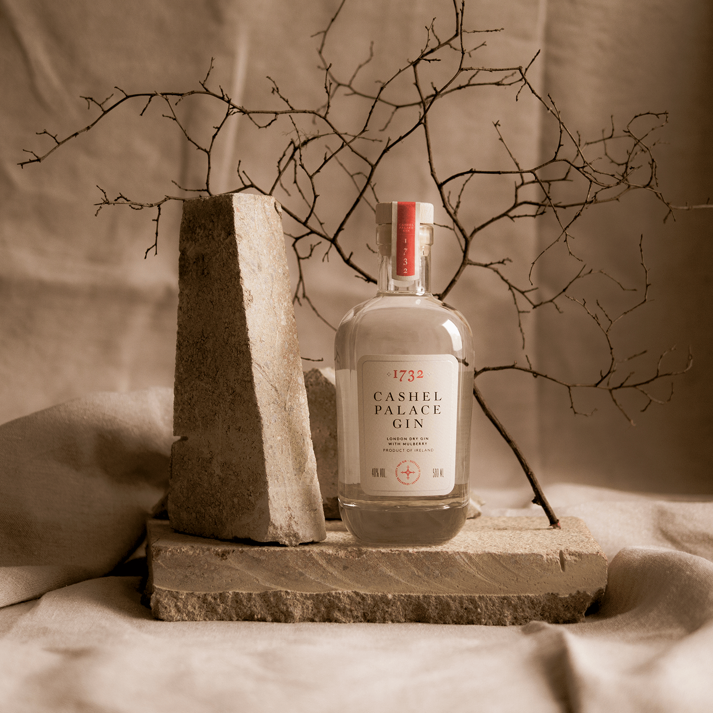
Cashel Palace
1732 GinChannelling heritage
Waterford
Gallery of ArtHousing the city collection
Trade
CoffeeOpening a café & barista school
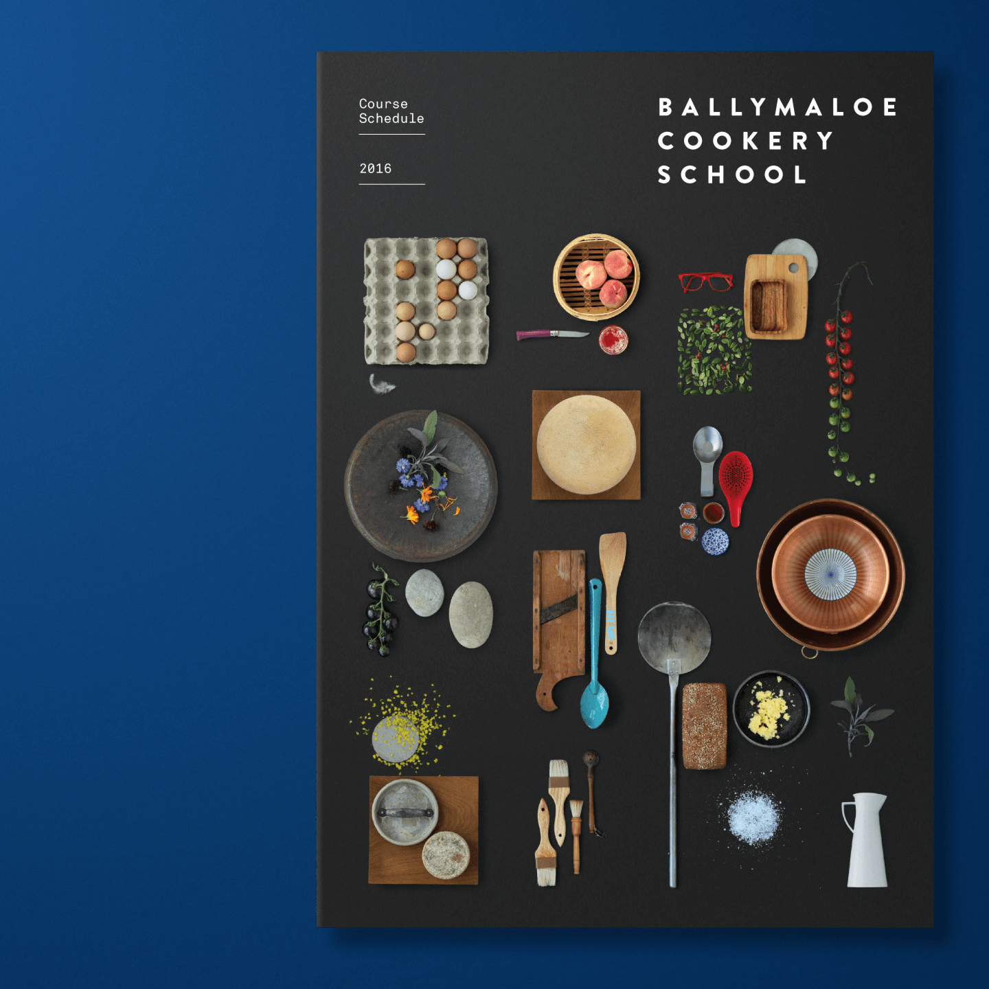
Ballymaloe
Cookery SchoolCommunicating an ethos
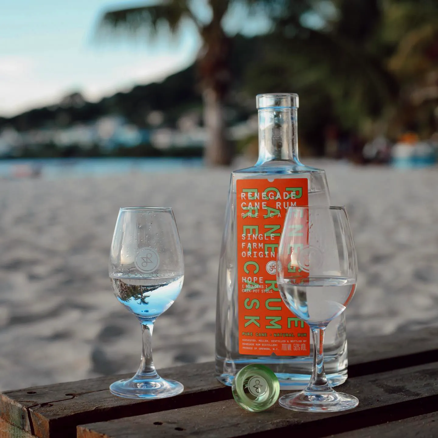
Renegade
RumLaunching Caribbean Cane Rum

Nearform
SoftwareTransformative branding scheme
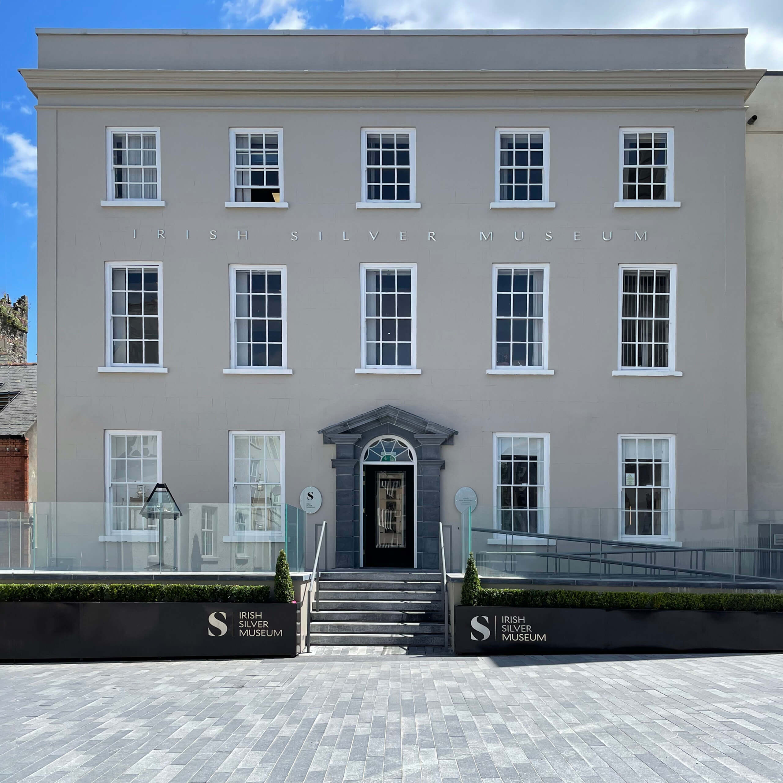
Irish Silver
Museum1000 years of Irish history

CakeFace
PatisserieBranding out of this world creations

Stafford
BondedCreating a face for a 130 year old family business

Ballymaloe
LitfestCreating festival alchemy

Collateral
Media ProductionVideo production agency
dhb
ArchitectsComposing a design-driven architectural firm
Document
FilmsProjecting a documentary and film studio
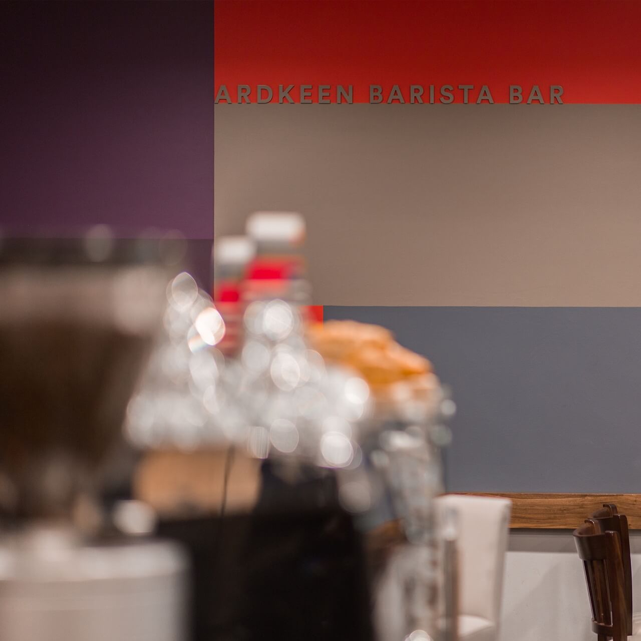
Ardkeen
Quality Food StoresRepresenting community and artisanal produce
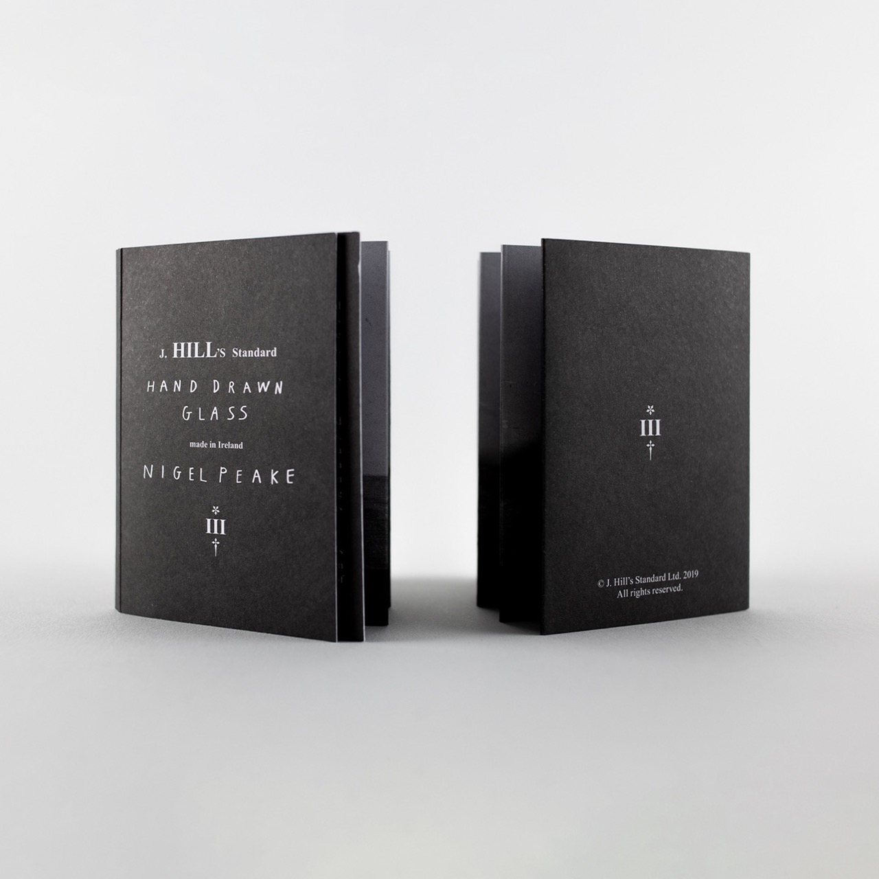
J.Hill's
StandardHand drawn crystal

Cake
FactoryRepresenting artists in NYC
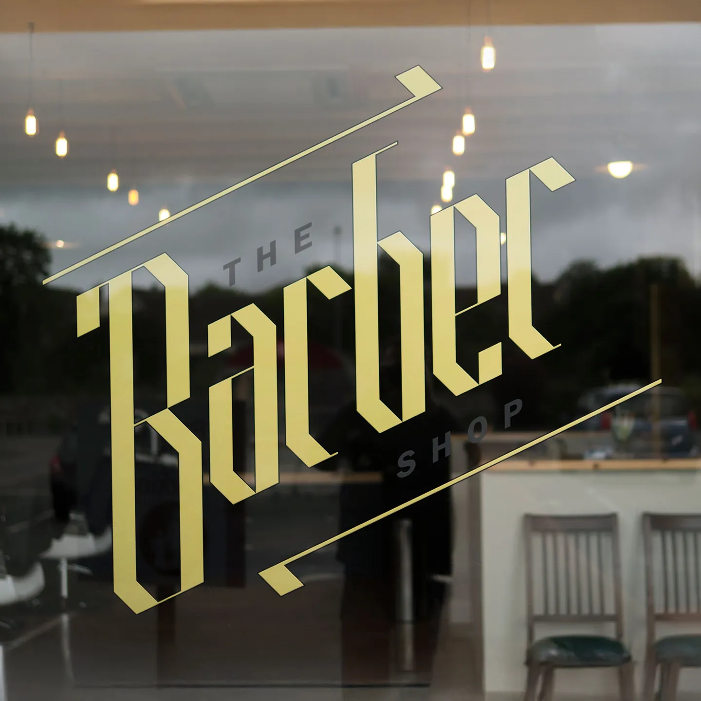
The Barber
ShopChoppy rebrand for new store

Invader
OperaThe first opera in 200 years
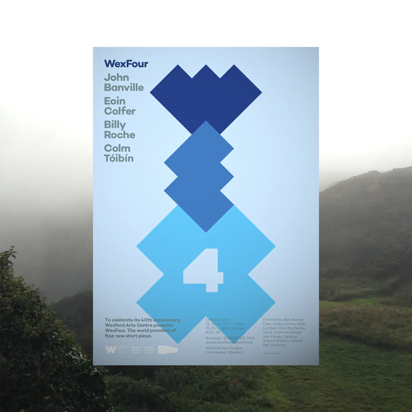
Wex
Four4 x Literary giants short plays
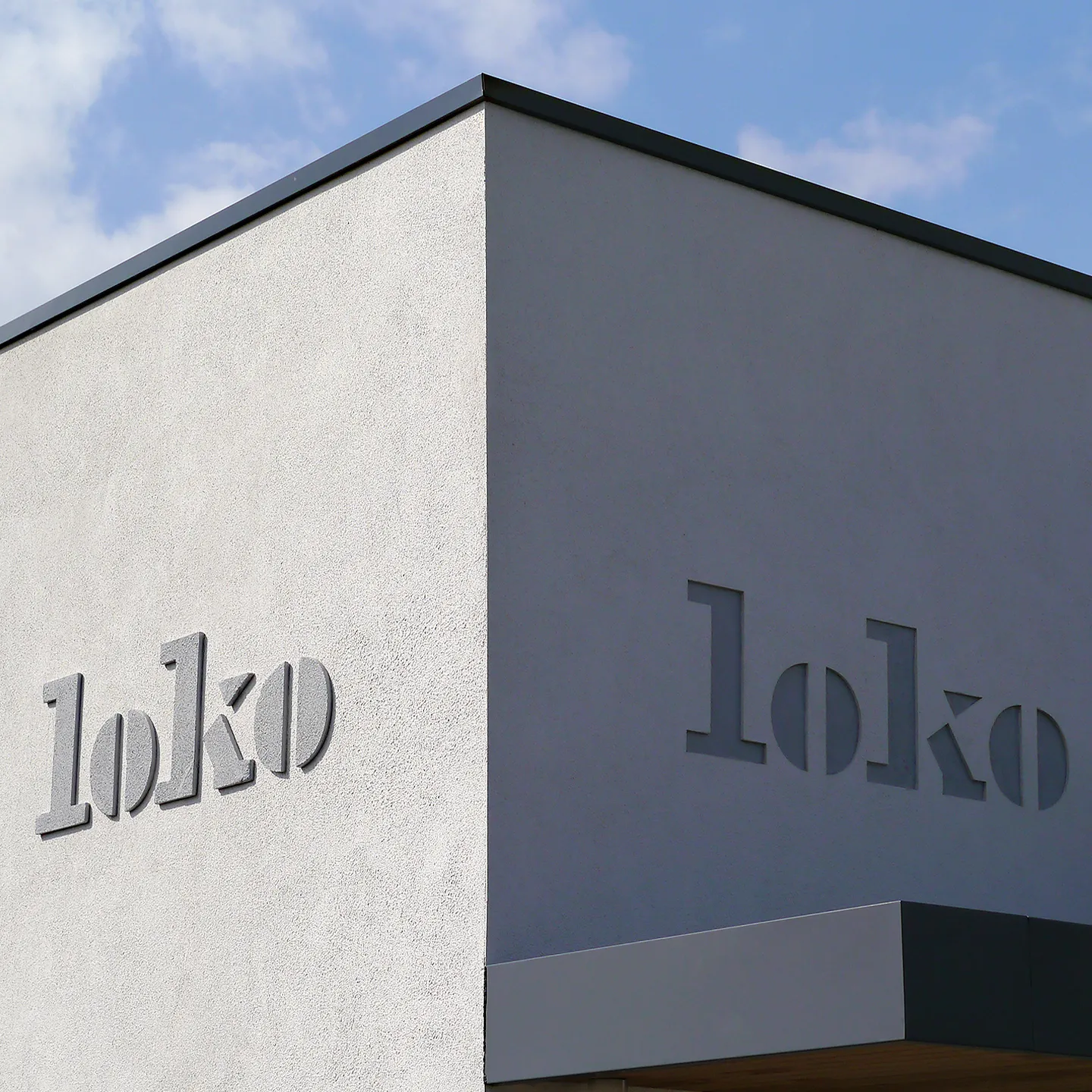
Loko
RestaurantBringing local to the neighbourhood

TRM
ClothingRebrand of a family store
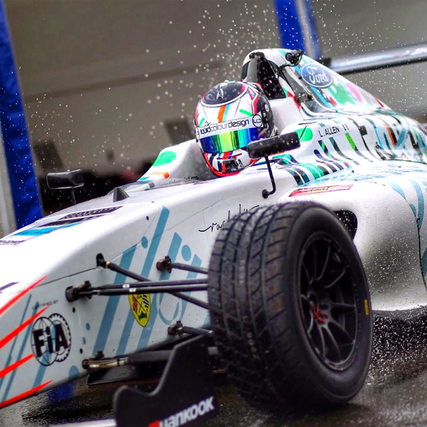
Formula 4
Car liveryInterpreting speed
Established 2011 © Copyright TrueOutput: All rights reserved.